Topic 1.3 Notes – Tabular Representation and Summary Statistics for One Categorical Variable
What a One-Variable Categorical Distribution Shows
A categorical variable puts each observational unit into a group. The observational unit is the individual thing being recorded, like a student, a visit, or a response.
If the variable is “favorite school subject,” each student gets one category such as math, science, or English. The distribution is just the categories together with how much data is in each one. Here, 12 individual responses are sorted into four subject categories and then summarized with counts and relative frequencies.
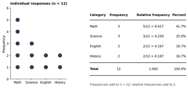
One-variable categorical distribution for favorite school subject
A few details matter a lot:
- Categories should be mutually exclusive. One observation goes in one category only.
- Categories should be exhaustive. Every observation should fit somewhere.
- You summarize categorical data with counts and proportions, not mean or standard deviation.
- Numeric labels can still be categorical. Zip code, jersey number, and survey code 1 to 5 are labels, not measured amounts.
- Some categories have a meaningful order, like poor, fair, good, excellent. That makes them ordinal. Changing the display order does not change the distribution itself.
Frequency and Relative Frequency Tables
These are the two main tables for one categorical variable. They show the same distribution in two forms.
Frequency tables
A frequency is the number of observations in a category.
Example with 20 students’ preferred lunch drink:
| Drink | Frequency |
|---|---|
| Water | 8 |
| Juice | 5 |
| Soda | 4 |
| Milk | 3 |
| Total | 20 |
Frequencies must be whole numbers, cannot be negative, and should add to the total number of included observations:
Relative frequency tables
A relative frequency is the share of the total in a category:
For water, that is .
| Drink | Relative Frequency | Percent |
|---|---|---|
| Water | 0.40 | 40% |
| Juice | 0.25 | 25% |
| Soda | 0.20 | 20% |
| Milk | 0.15 | 15% |
| Total | 1.00 | 100% |
Relative frequencies should be between 0 and 1 and add to 1, aside from rounding. Percentages should add to 100%.
A nice shortcut to remember is that counts and relative frequencies rank categories the same way, because every count is divided by the same total.
Other equivalent summaries
These all give part-to-whole information:
- Proportion =
- Relative frequency = 0.40
- Percentage = 40%
Ratios need more care:
- Part-to-total ratio of water is 8:20, which matches the proportion.
- Part-to-part ratio of water to soda is 8:4 or 2:1. That compares categories directly, so it is not the same as a proportion.
How to Build and Check a Table
Here’s the full process:
- Identify the observational units, variable, and categories.
- Tally each observation into exactly one category.
- Count each category for the frequency table.
- Divide each count by for relative frequency.
- Multiply by 100 if you want percent.
If values are missing, either include “missing” as a category or say clearly that those observations were left out. That changes the denominator.
Check your work:
- every observation counted once
- frequencies add to
- relative frequencies add to 1
- percentages add to 100%
- rounded percents may not convert back to exact counts
How to Describe and Use the Table
A strong AP Stats description names the group, the variable, the category, and the number.
Good example: “Among the 20 students surveyed, 8 students, or 40%, preferred water, making water the most common drink choice.”
Useful claims include:
- most common category
- least common category
- whether a category is a majority
- majority means more than 50%
- comparisons between categories
- combined categories, if the combination makes sense
If juice and soda are both “sweet drinks,” you can combine them:
- count =
- percent =
For comparisons, use:
- count difference if the question asks “how many more”
- percentage-point difference for subtraction of percents
Example: percentage points
What the Table Can and Cannot Prove
A one-variable categorical table describes the observed data. That’s it.
It does not automatically describe the whole population unless the sample was collected in a way that supports generalizing. It also does not show relationships between two variables, and it cannot support cause-and-effect claims.
Common mistakes:
- forgetting what the denominator is
- calling the largest category a majority when it is under 50%
- writing vague claims like “popular” with no numbers
- combining categories just to force a conclusion
- treating number labels as quantitative data
Key Takeaways
Frequency Table
Table listing each category of one categorical variable and the number of observational units in each category
Relative Frequency Table
Table listing each category and the proportion of all included observations in that category
Frequency
The count of observational units in a category
Relative Frequency
The proportion of all included observations in a category; f/n
Proportion / Percentage / Relative Frequency
Equivalent part-to-whole summaries of a category's share of the total; a proportion or relative frequency can be written as a decimal, fraction, or percent
Part-to-Part Ratio vs. Part-to-Whole Ratio
Part-to-whole compares a category to the total; part-to-part compares one category directly to another
Mutually Exclusive and Exhaustive Categories
Categories do not overlap, and together they include every observation
Constructing a Frequency Table
List categories, tally each observation into one category, count each category, and check frequencies sum to the number of included observations
Constructing a Relative Frequency Table
Divide each category frequency by the total number of included observations; the unrounded relative frequencies add to 1
Combining Categories
Add counts or relative frequencies of nonoverlapping categories when the combined group has a clear contextual meaning
Largest Category vs. Majority
The largest category has the greatest count or relative frequency; a majority is a category with more than half of all observations
Distribution of a Categorical Variable
The categories of a categorical variable and the amount of data in each category
Notes
Frequency Table
Table listing each category of one categorical variable and the number of observational units in each category
Relative Frequency Table
Table listing each category and the proportion of all included observations in that category
Frequency
The count of observational units in a category
Relative Frequency
The proportion of all included observations in a category; f/n
Proportion / Percentage / Relative Frequency
Equivalent part-to-whole summaries of a category's share of the total; a proportion or relative frequency can be written as a decimal, fraction, or percent
Part-to-Part Ratio vs. Part-to-Whole Ratio
Part-to-whole compares a category to the total; part-to-part compares one category directly to another
Mutually Exclusive and Exhaustive Categories
Categories do not overlap, and together they include every observation
Constructing a Frequency Table
List categories, tally each observation into one category, count each category, and check frequencies sum to the number of included observations
Constructing a Relative Frequency Table
Divide each category frequency by the total number of included observations; the unrounded relative frequencies add to 1
Combining Categories
Add counts or relative frequencies of nonoverlapping categories when the combined group has a clear contextual meaning
Largest Category vs. Majority
The largest category has the greatest count or relative frequency; a majority is a category with more than half of all observations
Distribution of a Categorical Variable
The categories of a categorical variable and the amount of data in each category
