Topic 5.1 Notes – Graphical Representations Between Two Quantitative Variables
What a Scatterplot Shows
A bivariate quantitative data set has two numerical measurements for each individual. That means each observation is an ordered pair .
- If you record hours studied and test score for each student, each student gives one pair.
- The pairing matters. A list of study hours and a separate list of scores is useless for a scatterplot unless you know which score goes with which student.
A scatterplot puts one point on the graph for each ordered pair and shows the association between the two quantitative variables.
- The explanatory variable goes on the x-axis. This is the variable used to explain or predict.
- The response variable goes on the y-axis. This is the outcome you’re watching.
Example: if you want to see whether hours studied helps predict test score, then
- hours studied
- test score
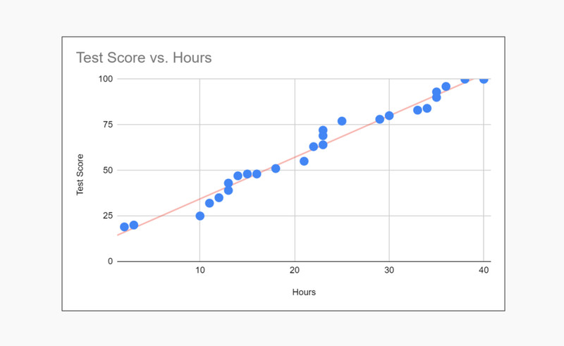
Scatterplot of test score vs. hours studied
That is exactly what the graph here shows. Each dot represents one student’s paired values for hours and test score.
Sometimes there is no obvious explanatory-response role. In that case, either axis choice is fine if the labels are clear.
One more boundary that gets tested a lot: scatterplots are only for two quantitative variables. If one variable is categorical, you need a different display.
Making a Scatterplot Correctly
Here’s what has to happen, in order, when you build one.
- Identify the individuals and the two quantitative variables measured on each one.
- Keep the data paired. Never separate matching - and -values.
- Put the explanatory variable on the horizontal axis and the response variable on the vertical axis.
- Label both axes with the variable names and units if given.
- Choose scales that fit the data and use equal numerical intervals on each axis.
- Plot one point per ordered pair.
- Leave the points unconnected. Connecting suggests a sequence, and scatterplots usually are not sequence graphs.
With technology, your two lists must stay aligned. If you sort only one list, you destroy the pairing and the graph becomes wrong.
Common mistakes teachers love to put on quizzes:
- Reversing axes without thinking about explanatory vs. response
- Missing labels or units
- Using a bad viewing window that hides the pattern
- Forgetting that repeated ordered pairs can overlap, so the graph may look like it has fewer points than it actually does
Describing a Scatterplot
A complete AP Stats description has four parts:
- form
- direction
- strength
- unusual features
And you should say it in context, using the variable names.
The examples below show several of those features in action.
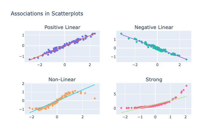
Common scatterplot patterns
Form
This is the overall shape.
- Linear means the points follow an approximate straight-line pattern.
- Nonlinear means the pattern curves.
- No clear form means the points look like a random cloud.
Direction
This tells how changes as increases.
- Positive association means as increases, tends to increase.
- Negative association means as increases, tends to decrease.
- Some plots have no clear direction, like a random cloud or a U-shape.
Strength
This is about how tightly the points follow the pattern.
- Strong = points stay close to the line or curve
- Moderate = some scatter, but pattern is clear
- Weak = lots of scatter
Strength is not about steepness. A gentle trend can be strong if points are tight.
Unusual Features
These are things worth mentioning because they affect interpretation.
- Clusters are separate groups of points
- Unusual points do not fit the main pattern
- Gaps or pattern changes can matter too
Writing the Description the Way AP Wants It
A strong template is:
“There is a [strength], [positive/negative], [linear/nonlinear] association between ___ and ___. As ___ increases, ___ tends to ___. The scatterplot also shows ___.”
Example:
“There is a moderate, positive, linear association between hours studied and test score. As hours studied increases, test score tends to increase. The scatterplot also shows one unusual point near .”
A few fixes that matter on the exam:
- Don’t just write “positive correlation.” That is incomplete.
- If the pattern is curved, say nonlinear. Don’t force “positive linear.”
- If there’s no clear association, say that directly.
Using Scatterplots to Support Claims
A scatterplot can support claims about association, not causation.
Valid claims from the graph alone:
- one variable tends to increase or decrease as the other increases
- the pattern looks linear or nonlinear
- the association looks strong, moderate, or weak
Claims the graph alone cannot justify:
- causation
- exact linearity
- statements like “every larger has a larger ”
If one point goes against the trend, mention it. Don’t let one exception erase a clear overall pattern unless it truly changes the message of the graph.
Key Takeaways
Bivariate Quantitative Data Set
Data with two quantitative measurements for each individual; each observation is a paired ordered pair (x, y)
Ordered Pair (x, y)
The two matched values for one individual in bivariate data, with x for one variable and y for the corresponding other variable
Scatterplot
A graph of the relationship between two quantitative variables in which each ordered pair is plotted as one point
Explanatory Variable / Independent Variable
The variable used to explain or predict the response; by convention placed on the x-axis
Response Variable / Dependent Variable
The variable being explained or predicted; by convention placed on the y-axis
Constructing a Scatterplot
Keep data paired; put explanatory on x and response on y; label variables and units; use consistent scales covering the data; plot one point per ordered pair; do not connect points
Form, Direction, Strength, and Unusual Features
The four characteristics used for a complete description of a scatterplot
Linear Association
An association in which the points follow an overall straight-line pattern
Nonlinear Association
An association in which the points follow a curved or bending pattern rather than a straight line
Positive Association
As the explanatory variable increases, the response variable tends to increase
Negative Association
As the explanatory variable increases, the response variable tends to decrease
Strength of Association
How closely the points follow the general pattern; described visually as strong, moderate, or weak
Cluster
A group of points concentrated in one region of the scatterplot and somewhat separated from other groups
Unusual Point
A point that lies apart from the main pattern of the scatterplot
Justifying a Claim with a Scatterplot
Use visible features of the scatterplot in context—form, direction, strength, and unusual features—to say whether a claim is supported or contradicted; a scatterplot shows association, not causation
Notes
Bivariate Quantitative Data Set
Data with two quantitative measurements for each individual; each observation is a paired ordered pair (x, y)
Ordered Pair (x, y)
The two matched values for one individual in bivariate data, with x for one variable and y for the corresponding other variable
Scatterplot
A graph of the relationship between two quantitative variables in which each ordered pair is plotted as one point
Explanatory Variable / Independent Variable
The variable used to explain or predict the response; by convention placed on the x-axis
Response Variable / Dependent Variable
The variable being explained or predicted; by convention placed on the y-axis
Constructing a Scatterplot
Keep data paired; put explanatory on x and response on y; label variables and units; use consistent scales covering the data; plot one point per ordered pair; do not connect points
Form, Direction, Strength, and Unusual Features
The four characteristics used for a complete description of a scatterplot
Linear Association
An association in which the points follow an overall straight-line pattern
Nonlinear Association
An association in which the points follow a curved or bending pattern rather than a straight line
Positive Association
As the explanatory variable increases, the response variable tends to increase
Negative Association
As the explanatory variable increases, the response variable tends to decrease
Strength of Association
How closely the points follow the general pattern; described visually as strong, moderate, or weak
Cluster
A group of points concentrated in one region of the scatterplot and somewhat separated from other groups
Unusual Point
A point that lies apart from the main pattern of the scatterplot
Justifying a Claim with a Scatterplot
Use visible features of the scatterplot in context—form, direction, strength, and unusual features—to say whether a claim is supported or contradicted; a scatterplot shows association, not causation
