Topic 1.6 Notes – Descriptions for One Quantitative Variable Distributions
What a One-Variable Quantitative Distribution Shows
A distribution tells you two things about one quantitative variable: the values it takes and how often those values occur.
What you’re describing is the data, not the graph type. Saying “this is a histogram” does not answer the question. You want to say what the histogram shows about, for example, quiz scores, wait times, or heights.
A complete description includes:
- shape
- center
- spread (variability)
- unusual features such as outliers, gaps, and clusters
Always write in context:
- name the variable
- include units if there are units
- use approximate values or intervals from the graph
Different graphs show different detail:
- Dotplots and stemplots show exact values more clearly
- Histograms group values into intervals, so you usually describe ranges, not exact data values
This comparison is helpful because it shows the same data displayed three ways. Focus on how the dotplot and stemplot make the individual values easy to see, and how the histogram groups those values into bars.
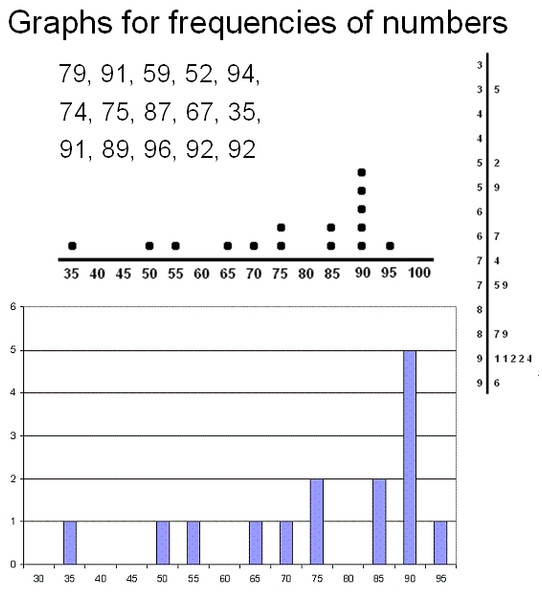
Same data shown as a dotplot, stemplot, and histogram
SOCS is a good memory tool for Shape, Outliers, Center, Spread. It helps you organize, but your answer still needs to sound like an actual description.
Shape and Unusual Features
Symmetry and skewness
Shape has two parts. One is whether the graph is symmetric or skewed.
- Approximately symmetric means the left and right sides are roughly mirror images
- Skewed right means the tail extends farther toward larger values
- Skewed left means the tail extends farther toward smaller values
The AP trap here is huge. Skew is named for the tail, not where most of the data are. If most values are on the left and the tail stretches right, it is skewed right.
Some graphs are messy and irregular. Don’t force a label if none fits well.
Peaks and modality
The other part of shape is peaks.
- Unimodal means one main peak
- Bimodal means two prominent peaks
- Approximately uniform means about the same frequency across values, with no clear peak
You can combine these, like skewed right and unimodal or approximately symmetric and bimodal.
Minor bumps do not create extra modes. Look for the overall pattern. Also, the peak is not always the center.
Outliers, gaps, and clusters
These are the unusual features you’re expected to notice.
- Outlier means an unusually high or low value relative to the rest
- Gap means an interval with no observations
- Cluster means a concentration of values, often separated by a gap
Give locations in context, like “an apparent outlier around 51 minutes,” not just “there is an outlier.” In the example below, most response times form one main cluster, there’s a clear gap before the far right, and a single outlier at about 51 minutes.

Dotplot showing an outlier, gap, and main cluster
Center and Spread
The center is the typical or middle value of the distribution. On a graph, you estimate it.
Center is not automatically:
- the midpoint of the axis
- the midpoint of min and max
- the tallest bar
- the most common exact value
The spread tells how much the values vary. You can describe it with:
- approximate minimum and maximum
- overall span
- width of the main cluster
- whether values are tightly packed or spread out
- long tails or isolated extremes
If there’s an outlier, separate the main spread from the total spread. For example, “most response times are from about 8 to 28 minutes, but overall they range from 8 to 51 minutes.”
Writing a Complete Description
A strong AP-style description usually sounds like this:
“The distribution of response times is skewed right and unimodal, centered at about 15 minutes, with most values from about 8 to 28 minutes and an overall range from about 8 to 51 minutes. There is an apparent high outlier at about 51 minutes.”
That works because it includes, in order:
- variable and units
- shape
- center
- spread
- unusual features
If you compare two distributions of the same variable, use comparative language such as “Group A has a higher center and less variability than Group B.”
Using the Graph to Justify Claims and Common Mistakes
When you justify a claim, point to evidence from the graph itself:
- counts or proportions in an interval
- center above or below some value
- tail direction
- peaks, gaps, clusters, or outliers
Example: “Most requests were answered in under 19 minutes because about 23 of the 30 observations are between 8 and 18 minutes.”
That claim is about the observed data shown. It does not automatically describe a whole population.
Common mistakes:
- saying “most data are on the left, so skewed left”
- naming the graph instead of the distribution
- leaving out variable or units
- calling empty axis space a gap
- claiming exact values from a histogram bin
- saying “the graph looks like it” without evidence
Key Takeaways
SOCS
Shape, outliers, center, spread; a mnemonic for organizing a description, not a description by itself
Shape
The overall form of a distribution, including symmetry or skewness and the number and prominence of peaks
Center
The typical or middle location of a distribution; estimated from the graph as an approximate value in the variable's units
Variability or Spread
How much the observed values differ from one another and how widely they are distributed
Approximately Symmetric
A distribution whose left half is approximately a mirror image of its right half
Skewed Right / Positively Skewed
A distribution whose tail extends farther toward larger values than toward smaller values
Skewed Left / Negatively Skewed
A distribution whose tail extends farther toward smaller values than toward larger values
Unimodal
A distribution with one main peak
Bimodal
Having two prominent peaks
Approximately Uniform
A distribution with approximately equal frequencies or relative frequencies across values or intervals and no prominent peaks
Outlier
A data point that is unusually small or unusually large relative to the rest of the data
Gap
A region between two values in which there are no observed data
Cluster
A concentration of observations, usually separated from another concentration by a gap or lower-frequency region
Complete Graphical Description
A description of the distribution's shape, center, spread, and unusual features in context, including the variable and its units when available
Justify a Claim Using a Graph
Support or refute a claim by connecting it to specific graphical evidence from the observed data
Notes
SOCS
Shape, outliers, center, spread; a mnemonic for organizing a description, not a description by itself
Shape
The overall form of a distribution, including symmetry or skewness and the number and prominence of peaks
Center
The typical or middle location of a distribution; estimated from the graph as an approximate value in the variable's units
Variability or Spread
How much the observed values differ from one another and how widely they are distributed
Approximately Symmetric
A distribution whose left half is approximately a mirror image of its right half
Skewed Right / Positively Skewed
A distribution whose tail extends farther toward larger values than toward smaller values
Skewed Left / Negatively Skewed
A distribution whose tail extends farther toward smaller values than toward larger values
Unimodal
A distribution with one main peak
Bimodal
Having two prominent peaks
Approximately Uniform
A distribution with approximately equal frequencies or relative frequencies across values or intervals and no prominent peaks
Outlier
A data point that is unusually small or unusually large relative to the rest of the data
Gap
A region between two values in which there are no observed data
Cluster
A concentration of observations, usually separated from another concentration by a gap or lower-frequency region
Complete Graphical Description
A description of the distribution's shape, center, spread, and unusual features in context, including the variable and its units when available
Justify a Claim Using a Graph
Support or refute a claim by connecting it to specific graphical evidence from the observed data
