Topic 1.4 Notes – Graphical Representations for One Categorical Variable
What a Categorical Distribution Shows
A categorical variable puts each observational unit into exactly one category. If the variable is “usual transportation,” each student goes into one category like car, bus, or walk.
The distribution tells you two things:
- what the categories are
- how often each category occurs
You can express that three equivalent ways:
- Frequency = count in each category
- Relative frequency = proportion in each category
- Percentage = relative frequency
The main calculation here is
If 48 out of 120 students usually come by car, the relative frequency is
Always check totals:
- frequencies add to
- relative frequencies add to
- percentages add to apart from rounding
One easy test mistake is reading a graph as counts when it actually shows proportions. Check the axis or labels every time.
Also, categorical distributions are described by which categories are common or uncommon and how categories compare. You do not describe them with shape, center, spread, or outliers. Those are for quantitative data.
Bar Charts and Pie Charts
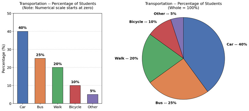
Both graphs display one categorical variable. For one data set, the category with the largest count also has the largest proportion, tallest bar, and biggest slice. Here, the transportation categories are shown as both a bar chart and a pie chart, so you can see how the same distribution looks in each format.
Bar charts
A bar chart has one bar per category.
- bar height or length shows frequency or relative frequency
- bars have equal width
- bars have gaps between them
- categories go on one axis
- counts, relative frequencies, or percents go on the other axis
- the numerical scale should begin at zero
In the example, the bar chart uses percentages on the vertical axis and starts at zero, which is exactly what you want.
Category order can be:
- logical
- alphabetical
- decreasing by frequency
A common confusion is bar chart vs histogram.
- Bar chart = categorical data, bars have gaps
- Histogram = quantitative data grouped into intervals, bars touch
Pie charts
A pie chart shows the whole data set as one circle.
- each slice is one category
- slice area shows relative frequency
- all slices together make
The transportation pie chart labels each slice by percent, which makes the part-to-whole relationship easy to scan.
The slice angle comes from
where is the relative frequency. If , the angle is .
Pie charts only make sense when:
- categories are mutually exclusive
- categories make up the whole data set
They get weak when there are lots of categories or the categories are close in size. Bar charts are usually easier to compare.
Making and Choosing the Right Graph
Here’s the flow.
- List the categories and counts.
- If needed, convert counts to relative frequencies by dividing by total .
- Build the graph that matches what you want to show.
For a bar chart:
- label categories clearly
- decide whether the axis shows counts or proportions
- use equal-width bars, gaps, and a zero baseline
For a pie chart:
- convert each category to a proportion or percent
- if drawing by hand, find each slice angle
- label slices clearly
Use frequency when actual numbers matter. Use relative frequency when you’re making percent/proportion claims or comparing groups of different sizes. A pie chart is always a relative-frequency display, even if counts are written on it.
Reading the Graph and Justifying Claims
Your claim has to name the variable and the category in context. Say “Car was the most common transportation method among these 120 students,” not “the tallest bar was car.”
You should be able to justify claims like these:
- most or least common category
- one category is more common than another
- a category is above or above one-third
- combined categories make a majority
Use numbers from the graph or table. If you estimate from the picture, say about or approximately.
Graph evidence is descriptive. It does not prove causation, and by itself it does not justify broad generalizations.
Comparing Multiple Data Sets and Common Mistakes
To compare groups, you need the same categorical variable and the same category definitions. Keep the same category order and compatible scales.
If sample sizes are equal, compare frequencies directly. If sample sizes differ, compare relative frequencies.
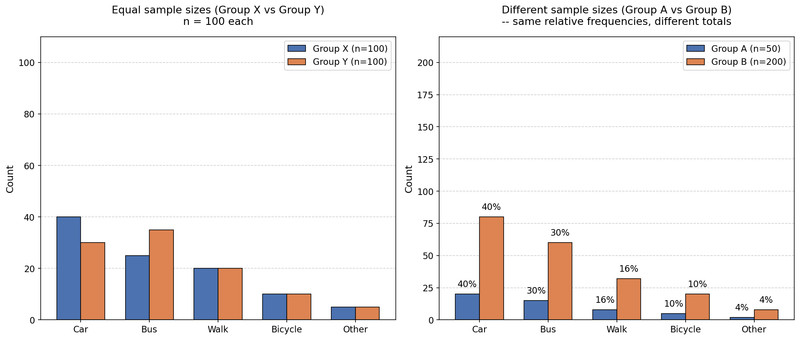
The two bar charts below show both situations. On the left, the groups each have , so counts can be compared directly. On the right, the totals are different, so the bars have the same pattern in percent even though the counts are much larger for one group.
Comparing counts and relative frequencies
Example. Group A has 35% choosing fruit and Group B has 30%. You’d say fruit is more common in Group A by 5 percentage points, since percentage points.
Common mistakes:
- ignoring whether the graph shows count or percent
- comparing raw counts when sample sizes differ
- using a truncated bar-chart axis
- forgetting gaps in bar charts
- making a pie chart when categories overlap or do not make up the whole
- making vague claims with no numerical support
Key Takeaways
Categorical Distribution
The categories of a categorical variable and how frequently they occur
Frequency
The count of observational units in a category
Relative Frequency (Proportion)
The count in a category divided by the total number of observations; a category's share of the data
Percentage
A relative frequency multiplied by 100%
Bar Chart (Bar Graph)
A graph for one categorical variable with one bar per category; bar height or length shows frequency, relative frequency, or percentage, and the bars are separated by gaps
Pie Chart
A graph that represents the whole data set as a circle; each slice is a category, and the slice’s area as a fraction of the circle equals the category’s relative frequency
Bar Chart vs. Histogram
Bar charts display categorical data with gaps between bars; histograms display quantitative intervals and adjacent bars usually touch
Pie-Chart Central Angle
For relative frequency p, slice angle = 360°p
When a Pie Chart Is Appropriate
When categories are mutually exclusive parts of one whole and account for the entire data set
Mode (Modal Category)
The category with the greatest frequency; equivalently, for one data set, the greatest relative frequency
Justifying a Claim from a Categorical Graph
Support the claim with the relevant count or proportion from the graph and state what it means in context
Comparing Categorical Data Sets
Compare the same categorical variable across data sets using the same category definitions and, when using separate graphs, the same category order and compatible scales
When to Use Relative Frequency for Comparison
Use relative frequencies to compare categorical distributions when data sets have different sizes; raw counts are directly comparable when data sets have the same size
Percentage Points
The arithmetic difference between two percentages, such as 35% - 30% = 5 percentage points
Misleading Categorical Graph
A graph in which the visual sizes do not correspond accurately to the frequencies or relative frequencies, such as from a truncated bar-chart axis, unequal visual scaling, or distorted images
Frequency Bar Chart vs. Relative-Frequency Bar Chart
Frequency bar chart: bar heights give counts in each category; relative-frequency bar chart: bar heights give proportions or percentages in each category
Frequency Table
A table listing each category and its frequency
Relative-Frequency Table
A table listing each category and its relative frequency or percentage
Notes
Categorical Distribution
The categories of a categorical variable and how frequently they occur
Frequency
The count of observational units in a category
Relative Frequency (Proportion)
The count in a category divided by the total number of observations; a category's share of the data
Percentage
A relative frequency multiplied by 100%
Bar Chart (Bar Graph)
A graph for one categorical variable with one bar per category; bar height or length shows frequency, relative frequency, or percentage, and the bars are separated by gaps
Pie Chart
A graph that represents the whole data set as a circle; each slice is a category, and the slice’s area as a fraction of the circle equals the category’s relative frequency
Bar Chart vs. Histogram
Bar charts display categorical data with gaps between bars; histograms display quantitative intervals and adjacent bars usually touch
Pie-Chart Central Angle
For relative frequency p, slice angle = 360°p
When a Pie Chart Is Appropriate
When categories are mutually exclusive parts of one whole and account for the entire data set
Mode (Modal Category)
The category with the greatest frequency; equivalently, for one data set, the greatest relative frequency
Justifying a Claim from a Categorical Graph
Support the claim with the relevant count or proportion from the graph and state what it means in context
Comparing Categorical Data Sets
Compare the same categorical variable across data sets using the same category definitions and, when using separate graphs, the same category order and compatible scales
When to Use Relative Frequency for Comparison
Use relative frequencies to compare categorical distributions when data sets have different sizes; raw counts are directly comparable when data sets have the same size
Percentage Points
The arithmetic difference between two percentages, such as 35% - 30% = 5 percentage points
Misleading Categorical Graph
A graph in which the visual sizes do not correspond accurately to the frequencies or relative frequencies, such as from a truncated bar-chart axis, unequal visual scaling, or distorted images
Frequency Bar Chart vs. Relative-Frequency Bar Chart
Frequency bar chart: bar heights give counts in each category; relative-frequency bar chart: bar heights give proportions or percentages in each category
Frequency Table
A table listing each category and its frequency
Relative-Frequency Table
A table listing each category and its relative frequency or percentage
