Topic 1.8 Notes – Graphical Representations of Summary Statistics for One Quantitative Variable
The Five-Number Summary and What a Boxplot Shows
The five-number summary lists these in order:
- minimum
- median
- maximum
Quartiles come from ordered data. They split the distribution into four roughly equal parts. So:
- about 25% of observations are in each quartile
- the middle 50% goes from to
- that distance is the IQR
You can also get the range from the summary with maximum minus minimum, but range and IQR are not themselves part of the five-number summary.
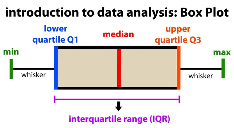
A boxplot is the graph of that summary. In the diagram, notice that the box stretches from to , with the median marked inside.
- the box runs from to
- the line inside is the median
- the whiskers extend outward toward the minimum and maximum
One easy mistake is thinking longer parts of the boxplot mean more data there. They do not. Each quartile still has about 25% of the data. A longer section only means more spread in that part of the distribution.
Also, boxplots compress a lot. Different data sets can have the same five-number summary and the same boxplot.
How to Construct a Boxplot
You may be given raw data or the five-number summary. If you have raw data, order it first and use your class quartile rule.
Here’s the construction in order:
- Find the five-number summary.
- Compute the IQR.
- Check for outliers using fences
A value is a potential outlier if it is below the lower fence or above the upper fence. Strict inequality matters. If a value lands exactly on a fence, it is not an outlier.
- Draw a labeled quantitative axis.
- Draw the box from to , with a median line inside.
- Draw whiskers to the most extreme non-outlier values.
- Plot outliers individually with dots or asterisks.
The fences are for calculation only. They are usually not drawn on the finished boxplot.
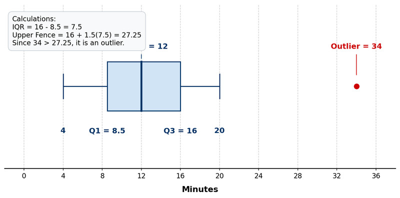
If the minimum or maximum is an outlier, it still stays in the five-number summary, but on the graph it appears as a separate point rather than as the whisker endpoint. In the example below, 34 is above the upper fence, so it is plotted separately and the right whisker stops at 20.
How to Read a Boxplot
From a boxplot, you can read:
- , median,
- the IQR
- whisker endpoints
- any displayed outliers
If there are no outliers, whisker endpoints are the minimum and maximum. If there are outliers, whiskers only show the smallest and largest non-outliers.
You can also make interval statements:
- about 25% are at or below
- about 50% are at or below the median
- about 75% are at or below
- about 50% lie between and
Use the axis scale when describing spread. Visual length by itself can fool you.
A boxplot does not show the mean, standard deviation, sample size, exact frequencies, clusters, gaps, or modes very well.
Shape, Skewness, and Mean Versus Median
A boxplot can suggest shape, even though it does not show full detail.
Symmetry
A distribution looks approximately symmetric when:
- the median is near the center of the box
- the two halves of the box are similar lengths
- the whiskers are about the same length
Right skew
A distribution suggests right skew when:
- the upper half of the box or upper whisker is longer
- there are high outliers
- the median is closer to than to
Then the mean is usually greater than the median because the mean gets pulled toward the long right tail.
Left skew
A distribution suggests left skew when:
- the lower half of the box or lower whisker is longer
- there are low outliers
- the median is closer to than to
Then the mean is usually less than the median.
Be careful here. A boxplot shows the median, not the exact mean. On the AP exam, you usually infer the likely relationship rather than read the mean directly.
Common Mistakes With Boxplots
- A longer whisker means more spread, not more data.
- Whiskers go to the most extreme non-outliers, not to the fences.
- Minimum and maximum still belong in the five-number summary even if they are outliers.
- Quartiles are about 25% each, not always exactly 25% in small data sets.
- A boxplot only suggests shape. It cannot prove clusters, gaps, or modes.
- Skewness descriptions use the relationship between mean and median, and students often accidentally say median when they mean mean.
Key Takeaways
Five-Number Summary
Minimum, Q1, median, Q3, maximum
Boxplot; Box-And-Whisker Plot
Graphical representation of the five-number summary: box from Q1 to Q3 with a line at the median; whiskers extend to the minimum and maximum if there are no outliers, or to the most extreme non-outliers if outliers are plotted separately
Modified Boxplot
Boxplot that plots outliers separately and extends whiskers only to the smallest and largest non-outliers
Interquartile Range (IQR)
Q3 - Q1; the distance from Q1 to Q3, equal to the length of the box and containing the middle approximately 50% of the data
1.5 × IQR Rule
Rule for potential outliers: x < Q1 - 1.5(IQR) or x > Q3 + 1.5(IQR)
Fences
Outlier cutoffs at Q1 - 1.5(IQR) and Q3 + 1.5(IQR); used to identify outliers, not usually drawn on the boxplot
Symmetric Distribution And Mean Vs. Median
If a distribution is relatively symmetric, the mean and median are relatively close
Right-Skewed Distribution And Mean Vs. Median
If a distribution is skewed right, the mean is usually greater than the median because large values in the right tail pull the mean upward
Left-Skewed Distribution And Mean Vs. Median
If a distribution is skewed left, the mean is usually less than the median because small values in the left tail pull the mean downward
Notes
Five-Number Summary
Minimum, Q1, median, Q3, maximum
Boxplot; Box-And-Whisker Plot
Graphical representation of the five-number summary: box from Q1 to Q3 with a line at the median; whiskers extend to the minimum and maximum if there are no outliers, or to the most extreme non-outliers if outliers are plotted separately
Modified Boxplot
Boxplot that plots outliers separately and extends whiskers only to the smallest and largest non-outliers
Interquartile Range (IQR)
Q3 - Q1; the distance from Q1 to Q3, equal to the length of the box and containing the middle approximately 50% of the data
1.5 × IQR Rule
Rule for potential outliers: x < Q1 - 1.5(IQR) or x > Q3 + 1.5(IQR)
Fences
Outlier cutoffs at Q1 - 1.5(IQR) and Q3 + 1.5(IQR); used to identify outliers, not usually drawn on the boxplot
Symmetric Distribution And Mean Vs. Median
If a distribution is relatively symmetric, the mean and median are relatively close
Right-Skewed Distribution And Mean Vs. Median
If a distribution is skewed right, the mean is usually greater than the median because large values in the right tail pull the mean upward
Left-Skewed Distribution And Mean Vs. Median
If a distribution is skewed left, the mean is usually less than the median because small values in the left tail pull the mean downward
