Topic 1.9 Notes – Comparisons of the Distributions for One Quantitative Variable
Comparing distributions of one quantitative variable
Here, you are comparing the same quantitative variable in different groups. That could be test scores for two classes, commute times for two routes, or heights before and after a program. The variable has to be the same, with the same units.
A real comparison does more than describe each graph separately. You need to say how they differ.
A full comparison usually checks these four features together:
- Shape
Are the distributions symmetric or skewed? Unimodal or bimodal? - Center
Which group has the higher typical value? - Variability
Which group is more spread out, and by what measure? - Unusual features
Are there outliers, gaps, or clusters?
And always say it in context. For example, say “Route A commute times have a lower median by about 3 minutes than Route B commute times,” not just “A is lower.”
A quick graph reminder helps because the graph controls what you can honestly claim:
- Histograms, dotplots, back-to-back stem-and-leaf plots show shape well. You can see clusters, gaps, and possible outliers.
- Side-by-side boxplots are great for medians, IQRs, spread, and possible outliers. They do not show clusters or modality.
What to compare in the distributions
Shape
Skew comes from the longer tail.
- Right-skewed means the tail stretches to larger values.
- Left-skewed means the tail stretches to smaller values.
- If the graph shows two clear peaks, it is bimodal.
Boxplots can hint at skewness if one whisker is longer or the median is off-center, but they do not show detailed shape.
Center
You usually compare mean or median.
- Use median with IQR for skewed data or data with outliers.
- Use mean with standard deviation for roughly symmetric data without strong outliers.
Use comparison language. Say “Group A has a median about 3 units higher than Group B,” not just list both medians.
Also remember:
- mean median for symmetric distributions
- mean median for right-skewed distributions
- mean median for left-skewed distributions
Variability
Spread needs a named measure.
- Range = max minus min. It uses only the extremes, so it is nonresistant.
- IQR = . It shows the spread of the middle 50% and is resistant.
- Standard deviation measures typical distance from the mean and is nonresistant.
One group can have a smaller IQR but a larger range or standard deviation. That shows why “more variable” needs evidence.
Unusual features
Outliers, gaps, and clusters can matter a lot.
A modified boxplot uses the outlier rule
An outlier is unusual relative to its own distribution, not because it looks far from another group.
How to read comparative graphs
Comparative histograms
Use the same scale and same bins. Different bins can make the shape look different.
If sample sizes are very different, relative-frequency histograms are better than raw counts.
The image below contrasts counts with relative frequency for the same distribution. For comparisons between groups of different sizes, focus on the relative histogram rather than the cumulative plots.
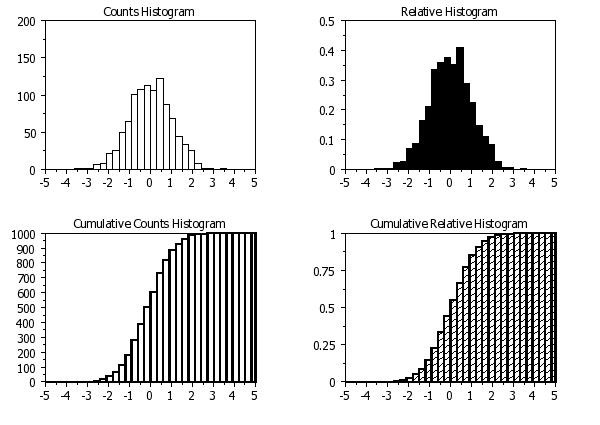
Counts vs. relative-frequency histograms
Aligned dotplots and back-to-back stem-and-leaf plots
These keep individual values, so they are excellent for small data sets. You can see overlap clearly, which matters because a higher center does not mean every value is higher.
Stem-and-leaf plots need a key, and both groups must use the same stem units.
Side-by-side boxplots
These let you compare medians, IQRs, nonoutlying spread, and possible outliers quickly.
A very common trap is thinking a longer box means more data. It does not. The box length shows IQR, and each quartile still contains about 25% of the data.
Writing and justifying a comparison
A strong AP Stats comparison usually sounds like this:
- Identify the variable, groups, and graph.
- Compare center with evidence.
- Compare variability with a named measure.
- Compare shape if the graph supports it.
- Mention outliers, gaps, or clusters.
- Tie the evidence to the claim.
If a histogram only gives rough values, use approximate language like “about,” “roughly,” or “appears to.”
Common weak answers:
- “A is higher”
- listing two medians with no actual comparison
- saying “more spread out” without naming how
- claiming exact values from a histogram
Z-scores as relative position
A z-score tells how many standard deviations a value is from the mean.
With population values,
With sample statistics,
Interpretation:
- positive means above the mean
- negative means below the mean
- larger magnitude means farther from the mean
- z-scores have no units
Example:
If a score is 84 on a test with mean 76 and SD 4,
That score is 2 standard deviations above the mean.
Raw score alone does not settle which performance is more impressive across different distributions. The larger signed z-score is the higher relative position. The larger absolute z-score is the more extreme value.
For times, where lower is better, a more negative z-score can mean better performance.
This normal curve example shows how z-scores place two values on the same standardized scale, even when the original measurements come from different contexts.
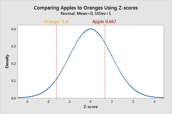
Comparing relative position with z-scores
Key Takeaways
Comparison of Distributions
Examining how the same quantitative variable differs across groups, samples, populations, times, or conditions by explicitly comparing shape, center, variability, and unusual features
Same Quantitative Variable
The variable being compared must be the same measurement with the same units in all distributions
SOCS for Comparison
Compare distributions by shape, center, variability, and unusual features such as outliers, gaps, and clusters
Comparison in Context
A comparison must name the variable, identify the groups, and include units when given
Skewness Direction
Skew is named for the longer tail: long tail to larger values means skewed right, long tail to smaller values means skewed left
Median and IQR Pairing
Use median with IQR for skewed distributions or distributions with outliers because both measures are resistant
Mean and Standard Deviation Pairing
Use mean with standard deviation for approximately symmetric distributions without strong outliers because both are nonresistant
Resistant vs Nonresistant Measures
Median and IQR are resistant to extreme values; mean, standard deviation, and range are nonresistant
Mean-Median Relationship and Skewness
In symmetric distributions mean and median are close; in right-skewed mean > median; in left-skewed mean < median
Range
Maximum minus minimum; describes the full observed span and is strongly affected by extreme values
Interquartile Range (IQR)
Q3 - Q1; measures the spread of the middle 50% of the data and is resistant to outliers
Standard Deviation
A typical distance of observations from their mean; a nonresistant measure of spread
Potential Outlier Rule
An observation is a potential outlier if it is below Q1 - 1.5(IQR) or above Q3 + 1.5(IQR)
Gap
An interval with no observed values
Cluster
A concentration of observations, often separated from another concentration by a gap
Comparative Histogram
Histograms for multiple groups compared on aligned axes using the same bin boundaries and bin widths
Relative-Frequency Histogram
A histogram showing proportions instead of counts; often better than frequency histograms when group sizes differ
Aligned or Stacked Dotplot
Comparative dotplots on a common quantitative scale that retain every observed value
Back-to-Back Stem-and-Leaf Plot
A stem-and-leaf plot with common stems in the center and leaves for two groups on opposite sides using the same stem and leaf units
Key for Stem-and-Leaf Plot
The key states what a stem and leaf represent, which is necessary because the same digits could mean different scales
Side-by-Side Boxplots
Boxplots for two or more groups on a common quantitative scale used to compare medians, IQRs, overall ranges or nonoutlying ranges, potential outliers, and possible skewness
Limits of Boxplots
Boxplots show medians, IQRs, ranges, outliers, and possible skewness, but not mean, standard deviation, detailed modality, gaps, or clusters
Modified Boxplot
A boxplot that marks potential outliers separately and extends whiskers only to the most extreme nonoutlying values
Common Scale and Common Bins
Comparative graphs must use compatible scales, and comparative histograms must use the same bin boundaries and widths, or visual comparisons may be misleading
Overlap
Shared values between distributions; a higher center for one group does not mean every observation in that group is higher
Histogram Approximation
Histograms usually allow only approximate conclusions about center, spread, or outliers because individual exact values are grouped into bins
Standardized Score (z-score)
A measure of relative position that tells how many standard deviations a value is above or below the mean; the standardized score most commonly used is the z-score
Population z-score Formula
z = (x - μ) / σ
Sample-Based z-score Formula
When population parameters are unknown, z may be computed as (x - x̄) / s
Interpretation of z-score Sign
Positive z means above the mean, negative z means below the mean, and z = 0 means equal to the mean
z-score Has No Units
A z-score is unitless because both x - μ and σ are measured in the same units
Standardizing a Distribution
Converting values to z-scores preserves order and shape but changes the center to 0 and the standard deviation to 1
Relative Position
Where a value falls within its own distribution, judged relative to that distribution’s mean and spread rather than by raw value alone
Comparing Relative Position with z-scores
The larger signed z-score is the higher relative position within its distribution
Absolute Value of z-score
|z| measures distance from the mean without regard to direction; larger |z| means more extreme relative to the mean
z-score Is Not a Percentile
A z-score alone does not give a percentile or probability without additional information about the distribution’s model or shape
Outlier Relative to Its Own Distribution
An outlier is unusual relative to its own distribution, not just because it is larger or smaller than values in another group
Notes
Comparison of Distributions
Examining how the same quantitative variable differs across groups, samples, populations, times, or conditions by explicitly comparing shape, center, variability, and unusual features
Same Quantitative Variable
The variable being compared must be the same measurement with the same units in all distributions
SOCS for Comparison
Compare distributions by shape, center, variability, and unusual features such as outliers, gaps, and clusters
Comparison in Context
A comparison must name the variable, identify the groups, and include units when given
Skewness Direction
Skew is named for the longer tail: long tail to larger values means skewed right, long tail to smaller values means skewed left
Median and IQR Pairing
Use median with IQR for skewed distributions or distributions with outliers because both measures are resistant
Mean and Standard Deviation Pairing
Use mean with standard deviation for approximately symmetric distributions without strong outliers because both are nonresistant
Resistant vs Nonresistant Measures
Median and IQR are resistant to extreme values; mean, standard deviation, and range are nonresistant
Mean-Median Relationship and Skewness
In symmetric distributions mean and median are close; in right-skewed mean > median; in left-skewed mean < median
Range
Maximum minus minimum; describes the full observed span and is strongly affected by extreme values
Interquartile Range (IQR)
Q3 - Q1; measures the spread of the middle 50% of the data and is resistant to outliers
Standard Deviation
A typical distance of observations from their mean; a nonresistant measure of spread
Potential Outlier Rule
An observation is a potential outlier if it is below Q1 - 1.5(IQR) or above Q3 + 1.5(IQR)
Gap
An interval with no observed values
Cluster
A concentration of observations, often separated from another concentration by a gap
Comparative Histogram
Histograms for multiple groups compared on aligned axes using the same bin boundaries and bin widths
Relative-Frequency Histogram
A histogram showing proportions instead of counts; often better than frequency histograms when group sizes differ
Aligned or Stacked Dotplot
Comparative dotplots on a common quantitative scale that retain every observed value
Back-to-Back Stem-and-Leaf Plot
A stem-and-leaf plot with common stems in the center and leaves for two groups on opposite sides using the same stem and leaf units
Key for Stem-and-Leaf Plot
The key states what a stem and leaf represent, which is necessary because the same digits could mean different scales
Side-by-Side Boxplots
Boxplots for two or more groups on a common quantitative scale used to compare medians, IQRs, overall ranges or nonoutlying ranges, potential outliers, and possible skewness
Limits of Boxplots
Boxplots show medians, IQRs, ranges, outliers, and possible skewness, but not mean, standard deviation, detailed modality, gaps, or clusters
Modified Boxplot
A boxplot that marks potential outliers separately and extends whiskers only to the most extreme nonoutlying values
Common Scale and Common Bins
Comparative graphs must use compatible scales, and comparative histograms must use the same bin boundaries and widths, or visual comparisons may be misleading
Overlap
Shared values between distributions; a higher center for one group does not mean every observation in that group is higher
Histogram Approximation
Histograms usually allow only approximate conclusions about center, spread, or outliers because individual exact values are grouped into bins
Standardized Score (z-score)
A measure of relative position that tells how many standard deviations a value is above or below the mean; the standardized score most commonly used is the z-score
Population z-score Formula
z = (x - μ) / σ
Sample-Based z-score Formula
When population parameters are unknown, z may be computed as (x - x̄) / s
Interpretation of z-score Sign
Positive z means above the mean, negative z means below the mean, and z = 0 means equal to the mean
z-score Has No Units
A z-score is unitless because both x - μ and σ are measured in the same units
Standardizing a Distribution
Converting values to z-scores preserves order and shape but changes the center to 0 and the standard deviation to 1
Relative Position
Where a value falls within its own distribution, judged relative to that distribution’s mean and spread rather than by raw value alone
Comparing Relative Position with z-scores
The larger signed z-score is the higher relative position within its distribution
Absolute Value of z-score
|z| measures distance from the mean without regard to direction; larger |z| means more extreme relative to the mean
z-score Is Not a Percentile
A z-score alone does not give a percentile or probability without additional information about the distribution’s model or shape
Outlier Relative to Its Own Distribution
An outlier is unusual relative to its own distribution, not just because it is larger or smaller than values in another group
