Topic 1.5 Notes – Graphical Representations for One Quantitative Variable
What a Graph of One Quantitative Variable Shows
A quantitative variable is a numerical measurement or count, like quiz scores, heights, or commute times. A graph of one quantitative variable puts those values from smallest to largest and shows either exact values or grouped intervals.
The three displays here are:
- Dotplot
- Stem-and-leaf plot (stemplot)
- Histogram
The big difference is detail:
- Dotplots and stemplots keep the individual observations visible.
- Histograms group values into intervals, so you lose exact values but see the overall pattern more clearly.
A complete graph needs:
- the variable identified by title or context
- a labeled axis
- units if they exist
- an evenly spaced numerical scale
- a frequency or relative frequency scale when needed
- a key for a stemplot
You also need to account for every observation exactly once. That’s the core correctness check on AP Stats.
For vertical scales:
- Frequency = number of observations
- Relative frequency = proportion of observations
Relative frequencies should add to or , aside from rounding.
Dotplots, Stemplots, and Histograms
These three displays can show the same quantitative data in different ways. In the example below, the dotplot keeps each exact value, the stemplot organizes those values by place value, and the histogram groups them into intervals.
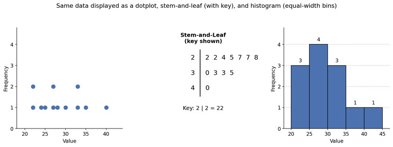
Same data in three displays
Dotplots
A dotplot uses one dot for one observation at its exact value.
- If a value repeats, the dots stack
- The height of the stack shows the frequency of that exact value
- Best for small data sets where exact values matter
In the example, the repeated values stack above the same number. That’s why dotplots are great when a question asks for repeats, minimum, maximum, or exact values.
Stem-and-leaf plots
A stemplot splits each value into a stem and a leaf.
- Example: with whole numbers, might mean 24
- Stems go in increasing order
- Leaves also go in increasing order
- Repeats show up as repeated leaves
You must include a key, because could mean 24, 2.4, or 240 depending on the data.
The stemplot in the figure uses stems 2, 3, and 4 with a key that tells you . Stemplots are best when the data set is small to moderate and the place values split nicely.
Histograms
A histogram groups data into bins or intervals.
- Each bar stands for a whole interval, not one exact value
- Bar height shows frequency or relative frequency in that interval
- Bars touch because the intervals are numerical and continuous
On the histogram here, you can see the overall shape quickly, but you can’t recover every exact data value from the bars. Histograms are best for larger or more crowded data sets.
How to Construct Each Graph
Dotplot
- Draw a numerical axis and label it.
- Use a scale covering the full data range.
- Place one dot per observation.
- Stack repeated values.
- Count dots and make sure the total is .
Stem-and-leaf plot
- Choose a consistent stem-leaf split.
- Write stems in order.
- Include empty stems if needed so the scale stays honest.
- Add one leaf per observation.
- Put leaves in increasing order.
- Include a key and units.
- Count leaves to make sure the total is .
If one stem gets crowded, you can split stems consistently, such as 0 to 4 on one row and 5 to 9 on another.
Histogram
- Choose ordered, nonoverlapping bins.
- Make sure every value goes into exactly one bin.
- Use equal-width bins in AP Stats.
- Count frequency or compute relative frequency for each bin.
- Draw touching bars in order.
- Label the vertical axis correctly.
- Make boundary rules clear, like lower included and upper excluded.
Choosing the Right Display and Reading It Correctly
Use a dotplot when you want exact values and the data set is small. Use a stemplot when you want exact values in a compact ordered display. Use a histogram when there are too many values for individual observations to be useful.
What each graph answers:
- Dotplot or stemplot
exact values, repeats, smallest value, largest value - Histogram
how many or what proportion fall in an interval
For histograms, always read the whole setup before interpreting bars:
- bin width
- starting point or boundaries
- frequency vs. relative frequency
Changing the bin width or starting point can make the same data look pretty different. A frequency histogram and a relative-frequency histogram with the same bins have the same shape. Only the vertical scale changes.
Common Mistakes and Easy Points to Lose
A lot of missed points here are tiny construction errors.
This comparison is a good quick reminder of one of the easiest mix-ups on the exam.
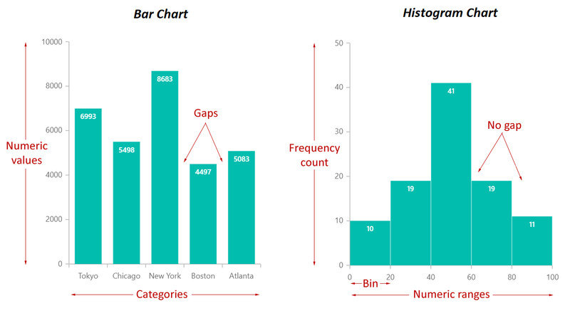
- Histogram vs. bar chart
Histograms are for quantitative data and use numerical intervals. Bar charts are for categorical data and usually have separated bars. - A histogram bar shows all values in an interval, not one exact value.
- Leaving out empty stems or zero-frequency bins can hide a gap.
- Uneven numerical scales make the graph wrong.
- No stemplot key = incomplete graph.
- Every observation must appear exactly once.
- Don’t mix up frequency and relative frequency on the vertical axis.
Key Takeaways
Dotplot
Graph of one quantitative variable with one dot for each observation placed at its value on a numerical axis; repeated values stack
Stem-and-Leaf Plot / Stemplot
Graph of one quantitative variable that splits each value into a stem and a leaf, orders stems and leaves from smallest to largest, and includes a key so the values can be read
Histogram
Graph of one quantitative variable that groups observations into ordered, nonoverlapping intervals called bins; bar height shows the frequency or relative frequency in each bin, and changing bin width or boundaries can change the appearance
Key
In a stemplot, a note that shows how to read the stems and leaves and includes the units, such as 2|4 = 24 minutes
Split Stems
A stemplot convention that divides one stem into two rows, often leaves 0–4 and 5–9, to make a crowded display easier to read
Histogram vs. Bar Chart
Histogram: quantitative variable, ordered numerical intervals, bars represent bins and usually touch. Bar chart: categorical variable, bars represent categories and are usually separated
Frequency Histogram / Relative-Frequency Histogram
Two histogram scales: frequency uses counts on the vertical axis; relative frequency uses proportions or percents. With the same bins, they have the same shape and differ only in vertical scale
Notes
Dotplot
Graph of one quantitative variable with one dot for each observation placed at its value on a numerical axis; repeated values stack
Stem-and-Leaf Plot / Stemplot
Graph of one quantitative variable that splits each value into a stem and a leaf, orders stems and leaves from smallest to largest, and includes a key so the values can be read
Histogram
Graph of one quantitative variable that groups observations into ordered, nonoverlapping intervals called bins; bar height shows the frequency or relative frequency in each bin, and changing bin width or boundaries can change the appearance
Key
In a stemplot, a note that shows how to read the stems and leaves and includes the units, such as 2|4 = 24 minutes
Split Stems
A stemplot convention that divides one stem into two rows, often leaves 0–4 and 5–9, to make a crowded display easier to read
Histogram vs. Bar Chart
Histogram: quantitative variable, ordered numerical intervals, bars represent bins and usually touch. Bar chart: categorical variable, bars represent categories and are usually separated
Frequency Histogram / Relative-Frequency Histogram
Two histogram scales: frequency uses counts on the vertical axis; relative frequency uses proportions or percents. With the same bins, they have the same shape and differ only in vertical scale
