Topic 2.1 Notes – Tabular and Graphical Representations for the Distributions of Two Categorical Variables
What It Means for Two Categorical Variables to Be Associated
A categorical variable puts each individual into a group, like grade level, favorite sport, or commute type. Here you have two categorical variables measured on the same individuals, so the pairing matters.
If one student is “Arts” and “Bus,” that student belongs in one specific combination. That combination becomes one cell in a display.
Association means the distribution of one variable is different across the levels of the other variable.
- If 50% of Arts students ride the bus but only 30% of STEM students do, the distributions differ.
- If the within-group percentages are about the same across groups, there is little or no association.
The main comparison is distribution vs. distribution. You are not just comparing one count to one count.
Also, be careful with group sizes:
- If one group is much bigger, raw counts can fool you.
- Proportions usually show association more clearly than counts when group sizes differ.
One more AP Stats point. Association here is descriptive only. It does not mean causation, statistical significance, or that the pattern must be true in the population.
Two-Way Tables and What to Read From Them
A two-way table (or contingency table) puts one variable in rows and the other in columns. Here’s a sample table that shows both the counts and the row and column percentages in the same display.
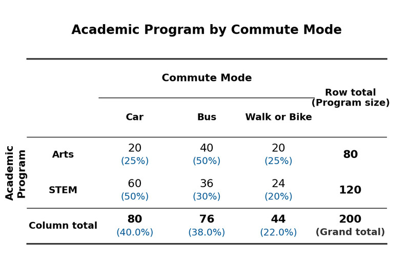
Two-way table with counts and relative frequencies
Each interior cell shows one category combination. In this example, the black numbers are counts and the blue percentages are relative frequencies.
Frequency tables
A frequency table uses exact counts.
- Interior cells tell how many individuals are in each combination.
- Row totals, column totals, and the grand total preserve actual group sizes.
- This is great when you need exact values.
But if you compare counts across unequal groups, you can get the wrong idea.
Relative-frequency tables
A relative-frequency table uses proportions or percentages. The huge issue here is the denominator.
- “Of all students” gives overall relative frequencies.
- “Of Arts students” gives row conditional relative frequencies.
- “Of bus riders” gives column conditional relative frequencies.
Those last two are not the same.
- “Of Arts students, 50% ride the bus”
- “Of bus riders, 50% are Arts students”
Same numbers could appear, but the meaning is different because the conditioning direction changed.
When judging association, compare the full set of within-group proportions. If several category percentages differ across groups, that supports association. One matching category does not erase the others.
Graphs for Two Categorical Variables
All three graphs compare one categorical variable across the levels of the other. In this example, the same Arts vs STEM transportation data is shown three different ways, so focus on what each display makes easiest to see.
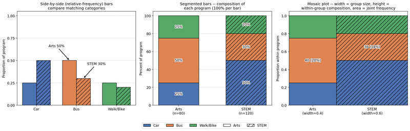
Three displays of the same two-way categorical data
Side-by-side bar charts
These put matching categories next to each other within each group.
- Can use counts or relative frequencies
- Relative-frequency versions are usually better with unequal group sizes
- Easiest graph for directly comparing matching category heights
Segmented bar charts
Each group is one bar split into pieces.
- Every bar represents 100% of its group
- Best for comparing composition
- Actual group size disappears
- Later segments are harder to compare because they do not share the same baseline
Mosaic plots
This is the one students misread most.
- Width shows group size
- Height shows within-group conditional proportions
- Area shows frequency or joint relative frequency
In the mosaic plot here, STEM is wider because the STEM group is larger. If boundaries line up across groups, that suggests little or no association. If they do not line up, that suggests association.
Choosing the Best Display and Making a Claim
Different displays answer different questions.
- Use a two-way table when exact counts or totals matter.
- Use a relative-frequency table or relative-frequency side-by-side bar chart when comparing distributions across unequal groups.
- Use a segmented bar chart when you care about composition only.
- Use a mosaic plot when you want composition and group size at the same time.
When you justify a claim, sound like this:
- Name the two variables and the groups.
- State whether they appear associated.
- Support it with proportions, counts, or visible graph features.
- Describe the difference in context and in the correct conditioning direction.
A strong AP-style sentence sounds like this:
“The variables appear associated because the distribution of commute mode differs across academic program. For example, 50% of Arts students ride the bus compared with 30% of STEM students.”
Common mistakes show up all the time:
- comparing raw counts when group sizes differ
- using one cell instead of the whole distribution
- reversing the conditioning statement
- claiming causation
- giving exact numbers from a graph that only shows rough sizes
Key Takeaways
Two-Way Table / Contingency Table
Table for two categorical variables; rows and columns are categories, and each interior cell is one category combination, with row totals, column totals, and a grand total
Associated Variables
Two categorical variables are associated when the distribution of one differs across the levels of the other
Side-by-Side Bar Chart / Clustered Bar Chart
Bar chart for two categorical variables with separate bars for categories of one variable within each category of the other; bars may show frequency or relative frequency
Segmented Bar Chart
Bar chart with one equal-length bar for each group, divided into segments for the other variable; each bar represents 100% of that group
Mosaic Plot
Display of a two-way table using rectangles; widths show group size, heights show conditional distribution within each group, and area shows cell frequency or joint relative frequency
Row-Conditional Relative Frequencies
Conditional proportions or percentages found by dividing each cell in a row by that row total
Column-Conditional Relative Frequencies
Conditional proportions or percentages found by dividing each cell in a column by that column total
Notes
Two-Way Table / Contingency Table
Table for two categorical variables; rows and columns are categories, and each interior cell is one category combination, with row totals, column totals, and a grand total
Associated Variables
Two categorical variables are associated when the distribution of one differs across the levels of the other
Side-by-Side Bar Chart / Clustered Bar Chart
Bar chart for two categorical variables with separate bars for categories of one variable within each category of the other; bars may show frequency or relative frequency
Segmented Bar Chart
Bar chart with one equal-length bar for each group, divided into segments for the other variable; each bar represents 100% of that group
Mosaic Plot
Display of a two-way table using rectangles; widths show group size, heights show conditional distribution within each group, and area shows cell frequency or joint relative frequency
Row-Conditional Relative Frequencies
Conditional proportions or percentages found by dividing each cell in a row by that row total
Column-Conditional Relative Frequencies
Conditional proportions or percentages found by dividing each cell in a column by that column total
