Topic 1.1 Notes – Introduction to Maps
What Maps Are
A map is a selective, symbolic picture of Earth. It is never the whole truth. A cartographer has to choose what goes in and what gets left out, so every map highlights some things and hides others.
What gets chosen:
- Area being shown, from a neighborhood to the whole world
- Time period, because a 1990 population map and a 2024 one tell different stories
- Variables shown, like language, rainfall, migration, or population
- Boundaries and units, such as countries, states, or counties
- Symbols and colors, which shape how patterns stand out
- Scale and projection, which affect detail and distortion
What to check first on any map:
- Title tells you what the map is about
- Legend/key explains symbols, colors, and shading
- Units tell you if data is total people, people per square mile, inches of rain, and so on
- Date tells you when the map is true
- Scale tells you map distance vs real distance
- Orientation tells you direction. North is common at the top, but not guaranteed.
Maps show two kinds of information:
- Qualitative means categories or types, like religion, language, or land use
- Quantitative means numbers, like population density or migration totals
Common symbols:
- Points for cities, ports, factories
- Lines for roads, rivers, borders, flows
- Areas for countries, climate zones, land cover
- Colors/shading/patterns/sizes for categories or amount
Absolute location uses latitude and longitude to pinpoint an exact spot.
Types of Maps
The two broad groups are reference maps and thematic maps. The difference is purpose.
Reference maps
Reference maps help you figure out where things are.
Common types:
- Political maps show countries, states, capitals, boundaries
- Physical maps show mountains, rivers, lakes, coastlines
- Road/transportation maps show highways, streets, rail lines, routes
- Topographic maps show elevation and relief with contour lines
Reference maps usually show many features at once. That is the clue.
Thematic maps
Thematic maps show the spatial pattern of one topic.
Common APHG types:
| Type | What it shows best | Common catch |
|---|---|---|
| Choropleth | Rates, percentages, densities by area | Raw totals can mislead |
| Dot-density | Clusters and gaps | Check what each dot equals |
| Proportional-symbol | Totals at specific places like cities | Bigger symbol does not mean density |
| Isoline | Equal values like elevation or temperature | Read line spacing carefully |
| Cartogram | Resized areas by variable like population | Shape/area are intentionally distorted |
| Flow map | Movement and direction | Arrows may show volume by thickness |
This comparison image pulls together four of the thematic map types you need to recognize quickly on the exam.
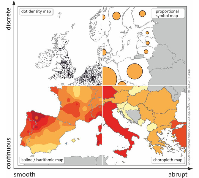
Thematic map types comparison
A common AP move is asking why this map type was used. Answer with the pattern it shows best.
Spatial Patterns Maps Show
Maps are useful because they reveal relationships across space.
Distance and direction
- Absolute distance is exact and measurable, like 5 miles or 8 kilometers.
- Relative distance is about time, cost, effort, or access. Two places can be close in miles but far in travel time.
- Absolute direction uses compass directions like north or southwest.
- Relative direction depends on local context, like upstream or toward downtown.
Distribution patterns
- Clustering means features bunch together
- Dispersal means features spread out
A pattern can look clustered on one map and dispersed on another if the scale changes. That shows up a lot in AP questions.
Elevation
Elevation is height above sea level. Maps show it with contour lines, spot elevations, color bands, or relief shading.
On a topographic map, the main quick reads are slope and landform shape.
Contour clues:
- Close lines = steep slope
- Wide spacing = gentle slope
- A V shape points upstream
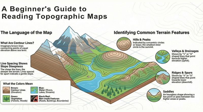
Topographic map features and contour lines
Scale and Projection
Map scale is the relationship between map distance and real-world distance.
Types of scale:
- Ratio like 1:50,000
- Verbal like 1 inch equals 1 mile
- Graphic/bar scale
A large-scale map shows a small area with lots of detail.
A small-scale map shows a large area with less detail.
Projection means putting Earth’s curved surface onto a flat map. That always creates distortion in one or more of these:
- Shape
- Area
- Distance
- Direction
Major projections:
- Mercator preserves local shape and direction fairly well, but badly exaggerates area near the poles. Greenland looks way too big compared with Africa.
- Gall-Peters preserves area, so size comparisons are better, but shapes get stretched.
- Robinson balances distortion for a more general world map.
The comparison image below lets you see those tradeoffs quickly across several world map projections.
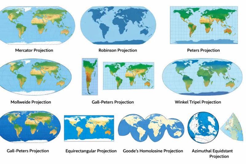
World map projection comparison
Projection families to recognize:
- Cylindrical
- Conic
- Planar/azimuthal
How to Read Maps on the Exam
When APHG gives you a map, read it like evidence.
- Identify the map type
- Identify the variable and units
- Describe the pattern precisely, such as clustered, dispersed, high elevation, short relative distance
- Watch for distortion from:
- Totals vs rates/densities
- Boundaries/reporting units
- Class intervals on choropleths
- Omitted information
- Generalization from map scale
- Projection distortion
The biggest idea here is simple. A map can show an association between two things, but the map by itself does not prove causation.
Key Takeaways
Map
A selective, symbolic representation of locations, features, and spatial relationships on Earth
Legend (Key)
The part of a map that explains the meanings of its symbols, colors, and patterns
Map Orientation
The directional alignment of a map, shown by indicators such as a north arrow or geographic grid
Qualitative Information vs. Quantitative Information
Qualitative information distinguishes categories or kinds; quantitative information reports numerical values
Latitude vs. Longitude
Latitude measures position north or south of the equator; longitude measures position east or west of the prime meridian
Reference Map
A map emphasizing the locations of features to help users locate places or travel between them
Political Map
A reference map showing governmental units, boundaries, cities, and capitals
Physical Map
A reference map showing natural features such as mountains, rivers, lakes, and coastlines
Road and Transportation Map
A reference map showing streets, highways, rail lines, routes, and transportation connections
Topographic Map
A reference map showing elevation, relief, and landform shape, usually with contour lines
Thematic Map
A map designed to show the geographic distribution, concentration, intensity, or movement of a particular subject
Choropleth Map
A thematic map that shades predefined areas according to ranges of a variable, especially rates, percentages, ratios, or densities
Dot-Density Map
A thematic map using dots, each representing an occurrence or stated quantity, to show a phenomenon's distribution and concentration
Proportional-Symbol Map
A thematic map placing symbols at locations and scaling each symbol's area to the magnitude of a variable
Graduated-Symbol Map
A thematic map that assigns symbols to a limited set of size classes representing ranges of values
Isoline Map
A thematic map using lines that connect points of equal value
Contour Line
An isoline connecting points of equal elevation
Contour Interval
The difference in elevation between successive contour lines
Cartogram
A thematic map that deliberately resizes geographic units according to a variable rather than actual land area
Flow Map
A thematic map using lines or arrows to show movement, with direction shown by arrows and volume often shown by line thickness
Absolute Distance
Measured physical separation expressed in standard units such as kilometers or miles
Relative Distance
Separation expressed through time, cost, accessibility, effort, or perception rather than fixed physical units
Absolute Direction
Direction based on a fixed frame of reference, such as cardinal directions or a compass bearing
Relative Direction
Direction described in relation to another feature or a locally understood frame of reference
Clustering
A spatial pattern in which mapped features are concentrated near one another
Dispersal
A spatial pattern in which features are spread across space rather than concentrated in one location
Elevation
The height of a location above a reference level, usually mean sea level
Relief
The differences between higher and lower elevations within an area
Map Scale
The relationship between a distance on a map and the corresponding distance on Earth
Representative Fraction (Ratio Scale)
A map scale written as a unitless ratio, such as 1:50,000, meaning one map unit equals 50,000 of the same ground units
Verbal Scale
A map scale stated in words, such as one centimeter represents one kilometer
Graphic Scale
A marked bar showing ground distance that remains proportionally accurate when resized with the map
Large-Scale Map vs. Small-Scale Map
A large-scale map shows a small area in greater detail; a small-scale map shows a large area in less detail
Map Projection
A mathematical method for transferring Earth's curved surface to a flat plane, inevitably distorting shape, area, distance, or direction
Conformal Projection
A projection that preserves local angles and small-area shapes but distorts area
Equal-Area Projection
A projection that preserves the correct relative areas of regions while distorting their shapes
Equidistant Projection
A projection preserving specified distances from a point or along selected lines, but not all distances everywhere
Cylindrical Projection
A projection based conceptually on a cylinder, usually with distortion increasing away from the equator
Conic Projection
A projection based conceptually on a cone that can minimize distortion across middle latitudes
Planar (Azimuthal) Projection
A projection conceptually made onto a plane touching the globe at one point; it preserves direction from the center, with distortion generally increasing outward
Mercator Projection
A cylindrical conformal projection that preserves local shapes and angles and shows lines of constant compass bearing as straight, but greatly exaggerates area toward the poles
Gall-Peters Projection
A cylindrical equal-area projection preserving relative area while stretching or compressing geographic shapes
Compromise Projection
A projection that balances multiple distortions rather than preserving any one spatial property perfectly
Robinson Projection
A compromise world projection that balances distortions of area, shape, distance, and direction for general reference
Notes
Map
A selective, symbolic representation of locations, features, and spatial relationships on Earth
Legend (Key)
The part of a map that explains the meanings of its symbols, colors, and patterns
Map Orientation
The directional alignment of a map, shown by indicators such as a north arrow or geographic grid
Qualitative Information vs. Quantitative Information
Qualitative information distinguishes categories or kinds; quantitative information reports numerical values
Latitude vs. Longitude
Latitude measures position north or south of the equator; longitude measures position east or west of the prime meridian
Reference Map
A map emphasizing the locations of features to help users locate places or travel between them
Political Map
A reference map showing governmental units, boundaries, cities, and capitals
Physical Map
A reference map showing natural features such as mountains, rivers, lakes, and coastlines
Road and Transportation Map
A reference map showing streets, highways, rail lines, routes, and transportation connections
Topographic Map
A reference map showing elevation, relief, and landform shape, usually with contour lines
Thematic Map
A map designed to show the geographic distribution, concentration, intensity, or movement of a particular subject
Choropleth Map
A thematic map that shades predefined areas according to ranges of a variable, especially rates, percentages, ratios, or densities
Dot-Density Map
A thematic map using dots, each representing an occurrence or stated quantity, to show a phenomenon's distribution and concentration
Proportional-Symbol Map
A thematic map placing symbols at locations and scaling each symbol's area to the magnitude of a variable
Graduated-Symbol Map
A thematic map that assigns symbols to a limited set of size classes representing ranges of values
Isoline Map
A thematic map using lines that connect points of equal value
Contour Line
An isoline connecting points of equal elevation
Contour Interval
The difference in elevation between successive contour lines
Cartogram
A thematic map that deliberately resizes geographic units according to a variable rather than actual land area
Flow Map
A thematic map using lines or arrows to show movement, with direction shown by arrows and volume often shown by line thickness
Absolute Distance
Measured physical separation expressed in standard units such as kilometers or miles
Relative Distance
Separation expressed through time, cost, accessibility, effort, or perception rather than fixed physical units
Absolute Direction
Direction based on a fixed frame of reference, such as cardinal directions or a compass bearing
Relative Direction
Direction described in relation to another feature or a locally understood frame of reference
Clustering
A spatial pattern in which mapped features are concentrated near one another
Dispersal
A spatial pattern in which features are spread across space rather than concentrated in one location
Elevation
The height of a location above a reference level, usually mean sea level
Relief
The differences between higher and lower elevations within an area
Map Scale
The relationship between a distance on a map and the corresponding distance on Earth
Representative Fraction (Ratio Scale)
A map scale written as a unitless ratio, such as 1:50,000, meaning one map unit equals 50,000 of the same ground units
Verbal Scale
A map scale stated in words, such as one centimeter represents one kilometer
Graphic Scale
A marked bar showing ground distance that remains proportionally accurate when resized with the map
Large-Scale Map vs. Small-Scale Map
A large-scale map shows a small area in greater detail; a small-scale map shows a large area in less detail
Map Projection
A mathematical method for transferring Earth's curved surface to a flat plane, inevitably distorting shape, area, distance, or direction
Conformal Projection
A projection that preserves local angles and small-area shapes but distorts area
Equal-Area Projection
A projection that preserves the correct relative areas of regions while distorting their shapes
Equidistant Projection
A projection preserving specified distances from a point or along selected lines, but not all distances everywhere
Cylindrical Projection
A projection based conceptually on a cylinder, usually with distortion increasing away from the equator
Conic Projection
A projection based conceptually on a cone that can minimize distortion across middle latitudes
Planar (Azimuthal) Projection
A projection conceptually made onto a plane touching the globe at one point; it preserves direction from the center, with distortion generally increasing outward
Mercator Projection
A cylindrical conformal projection that preserves local shapes and angles and shows lines of constant compass bearing as straight, but greatly exaggerates area toward the poles
Gall-Peters Projection
A cylindrical equal-area projection preserving relative area while stretching or compressing geographic shapes
Compromise Projection
A projection that balances multiple distortions rather than preserving any one spatial property perfectly
Robinson Projection
A compromise world projection that balances distortions of area, shape, distance, and direction for general reference
