Topic 2.5 Notes – The Demographic Transition Model
What the Demographic Transition Model Is
The DTM is a model that shows how crude birth rate, crude death rate, and natural increase usually change as a country develops. The basic pattern stays the same:
- high birth rates + high death rates
- death rate drops first
- birth rate drops later
- both end up low
That middle period matters most because population grows fastest there. Births stay high while deaths fall, so the gap between them gets wide before it narrows.
Variables to know
- CBR = births per 1,000 people
- CDR = deaths per 1,000 people
- RNI = population growth from births and deaths only
- If CBR is 30 and CDR is 10, RNI is 2%.
- Natural increase does not include migration. A country can still grow if lots of people move in.
How to read the graph
In the graph, focus on the blue birth-rate line, the orange death-rate line, and the yellow total-population curve.
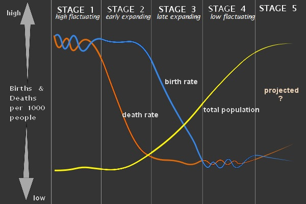
Demographic Transition Model graph
- x-axis shows time or development
- y-axis shows birth and death rates
- the distance between the birth-rate and death-rate lines shows natural increase
- the total population curve rises slowly, then quickly, then slows, and may level off or fall
Exam trap: a falling birth rate does not mean population decline. If births are still above deaths, population is still growing.
The Five Stages of the DTM
Stage 1
High stationary means high CBR and high CDR, both bouncing around. Growth stays low over the long run.
- Causes of high death rates include disease, famine, poor sanitation, and weak food supply.
- Causes of high birth rates include little contraception and the need for child labor.
- No whole countries are usually placed in Stage 1 today.
Stage 2
Early expanding starts when the CDR drops fast but the CBR stays high. This creates the fastest natural increase.
- Death rates fall because of clean water, sanitation, vaccines, public health, and more reliable food.
- This is the classic population explosion stage.
- A common example is parts of sub-Saharan Africa.
Stage 3
Late expanding means the CBR starts falling while the CDR stays low. Population still grows, just more slowly.
- Urbanization makes children less useful as labor.
- Contraception becomes more available.
- Women’s education and employment rise.
- Lower infant mortality reduces pressure to have many children.
- Population momentum means growth can continue because a large young population is entering childbearing years.
Stage 4
Low stationary has low CBR and low CDR. Growth is slow or close to zero.
- Often-used examples are the United States, Canada, and much of Western Europe.
- Total population can still rise because of immigration.
Stage 5
Declining means the CBR falls below the CDR.
- RNI becomes negative, so there is natural decrease.
- This is tied to below-replacement fertility, about 2.1 children per woman.
- Common examples are Japan, Germany, Italy, and China in recent years.
- Aging can push up the CDR even with great health care.
Population Pyramids and Stage Clues
Population pyramids help because they show the effects of fertility and mortality over time. The basic shapes at the top of the figure match the stage patterns, and the Angola and Japan examples show what those patterns look like in real populations.
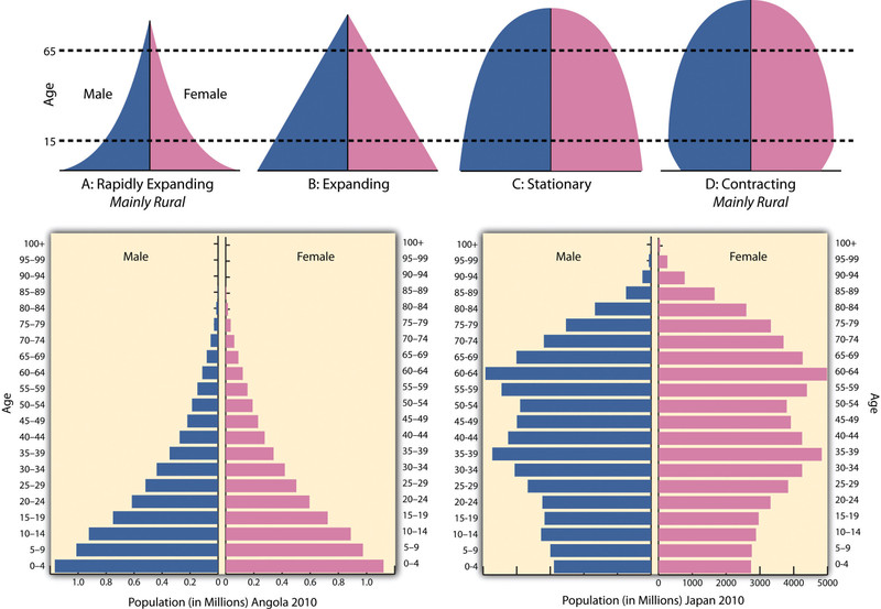
Population pyramid types and examples
- Stage 1 has a broad base, steep narrowing, and very few elderly people.
- Stage 2 has a very wide base and huge child cohorts.
- Stage 3 has a narrowing base and a wider working-age middle.
- Stage 4 looks more column-shaped.
- Stage 5 has a narrow base and a top-heavy or urn-shaped look.
Be careful with bulges and gaps. Migration, war, epidemics, and baby booms can distort the shape, so use pyramids as evidence, not proof by themselves.
The Epidemiological Transition
The epidemiological transition explains why death rates change. The DTM shows what happens to mortality. This model explains the causes of death behind it.
- Stage 1 pestilence and famine includes infectious disease, malnutrition, childbirth risks, and environmental hazards.
- Stage 2 receding pandemics comes from sanitation, safe water, better nutrition, and vaccination. This drives the DTM death-rate drop.
- Stage 3 degenerative and human-created diseases includes heart disease, cancer, diabetes, pollution, smoking, and accidents.
- Stage 4 delayed degenerative diseases means people still face chronic disease, but medicine delays death and increases life expectancy.
- Proposed Stage 5 involves reemerging infectious disease such as drug-resistant tuberculosis, malaria, and COVID-19. This does not mean countries automatically move backward in the DTM.
Why the Model Matters and Where It Breaks Down
The DTM is useful for comparing countries, explaining population growth, and linking development to age structure, urbanization, and dependency.
Its limits matter too:
- It was based mostly on Europe and North America.
- It gives no fixed timeline.
- It does not handle migration well.
- War, pandemics, and disasters can disrupt the pattern.
- National averages can hide regional differences.
- Stage 5 is debated.
On AP questions, the best move is to use dated CBR, CDR, RNI, and pyramid evidence together, then mention migration or another complicating factor if it matters.
Key Takeaways
Demographic Transition Model (DTM)
Model showing how birth rates, death rates, and natural increase change as a society develops, with death rates typically falling before birth rates
Crude Birth Rate (CBR)
Annual number of live births per 1,000 people, without adjustment for the population’s age or sex composition
Crude Death Rate (CDR)
Annual number of deaths per 1,000 people, without adjustment for the population’s age or sex composition
Rate of Natural Increase (RNI)
Annual percentage of population growth or decline from births and deaths alone; RNI = (CBR − CDR) ÷ 10
DTM Stage 1: High Stationary
High, fluctuating birth and death rates remain close together, producing little long-term natural increase
DTM Stage 2: Early Expanding
Death rates fall sharply while birth rates remain high, producing rapid natural increase
DTM Stage 3: Late Expanding
Birth rates decline while death rates remain low, so natural increase stays positive but slows
DTM Stage 4: Low Stationary
Low birth and death rates remain close together, producing little natural increase and a stable or slowly growing population
DTM Stage 5: Declining
Birth rates remain below death rates, producing negative natural increase and an aging population
Population Momentum
Continued population growth after fertility falls because a large cohort is entering its reproductive years
Replacement-Level Fertility
Average fertility needed for one generation to replace itself without migration, about 2.1 children per woman in many low-mortality populations
Epidemiological Transition Model
Model describing long-term shifts in the leading causes of illness and death as mortality patterns change
Epidemiological Stage 1: Pestilence and Famine
Infectious disease, famine, malnutrition, childbirth complications, and environmental hazards produce high, fluctuating mortality
Epidemiological Stage 2: Receding Pandemics
Improved nutrition, sanitation, public health, and medicine reduce infectious-disease deaths and raise life expectancy
Epidemiological Stage 3: Degenerative and Human-Created Diseases
Chronic diseases linked to aging, behavior, and industrial conditions replace infections as the leading causes of death
Epidemiological Stage 4: Delayed Degenerative Diseases
Medicine and behavioral changes postpone death from chronic diseases, extending life expectancy without replacing those diseases as leading causes
Epidemiological Stage 5: Reemergence of Infectious Disease
Proposed stage in which infectious diseases persist or return because of resistance, globalization, inequality, conflict, or weakened public health
Notes
Demographic Transition Model (DTM)
Model showing how birth rates, death rates, and natural increase change as a society develops, with death rates typically falling before birth rates
Crude Birth Rate (CBR)
Annual number of live births per 1,000 people, without adjustment for the population’s age or sex composition
Crude Death Rate (CDR)
Annual number of deaths per 1,000 people, without adjustment for the population’s age or sex composition
Rate of Natural Increase (RNI)
Annual percentage of population growth or decline from births and deaths alone; RNI = (CBR − CDR) ÷ 10
DTM Stage 1: High Stationary
High, fluctuating birth and death rates remain close together, producing little long-term natural increase
DTM Stage 2: Early Expanding
Death rates fall sharply while birth rates remain high, producing rapid natural increase
DTM Stage 3: Late Expanding
Birth rates decline while death rates remain low, so natural increase stays positive but slows
DTM Stage 4: Low Stationary
Low birth and death rates remain close together, producing little natural increase and a stable or slowly growing population
DTM Stage 5: Declining
Birth rates remain below death rates, producing negative natural increase and an aging population
Population Momentum
Continued population growth after fertility falls because a large cohort is entering its reproductive years
Replacement-Level Fertility
Average fertility needed for one generation to replace itself without migration, about 2.1 children per woman in many low-mortality populations
Epidemiological Transition Model
Model describing long-term shifts in the leading causes of illness and death as mortality patterns change
Epidemiological Stage 1: Pestilence and Famine
Infectious disease, famine, malnutrition, childbirth complications, and environmental hazards produce high, fluctuating mortality
Epidemiological Stage 2: Receding Pandemics
Improved nutrition, sanitation, public health, and medicine reduce infectious-disease deaths and raise life expectancy
Epidemiological Stage 3: Degenerative and Human-Created Diseases
Chronic diseases linked to aging, behavior, and industrial conditions replace infections as the leading causes of death
Epidemiological Stage 4: Delayed Degenerative Diseases
Medicine and behavioral changes postpone death from chronic diseases, extending life expectancy without replacing those diseases as leading causes
Epidemiological Stage 5: Reemergence of Infectious Disease
Proposed stage in which infectious diseases persist or return because of resistance, globalization, inequality, conflict, or weakened public health
