Topic 7.3 Notes – Measures of Development
What Development Measures Show
Development means changes in production, living standards, health, education, and overall quality of life. That is why one number can’t capture it all. A country can be rich in output but still have weak health care, unequal income, or poor education.
Geographers compare places with several kinds of indicators at once:
- Economic measures show production, income, jobs, and how the economy is organized.
- Social measures show health, education, and population conditions.
- Composite indices combine several measures into one score.
- Gender inequality measures show gaps national averages can hide.
Development is also uneven at every scale:
- between countries
- within countries
- between urban and rural areas
- between core and peripheral regions
- among ethnic, class, or gender groups
National averages help compare states, but they can hide huge internal differences.
Economic Measures of Development
Economic measures tell you how much a place produces and who that income belongs to.
GDP GNP and GNI
- GDP is the value of final goods and services produced inside a country’s borders.
- GNP is the value produced by a country’s residents and firms, even if production happens abroad.
- GNI is the total income earned by a country’s residents and businesses, including income from abroad.
The key distinction is simple:
- GDP = where production happens
- GNP/GNI = who owns it or receives the income
Ireland is the classic example. Multinational corporations make Irish GDP look very high, but some profits leave the country, so income available to residents is lower than GDP suggests.
Per capita and PPP
Per capita means per person.
Per capita measures are better than totals when comparing living standards, since a huge country can have high GDP but many poor people. Still, it is only an average, so inequality can disappear inside the number.
PPP or purchasing power parity adjusts for cost of living. It asks what money can actually buy in each country, so it is usually better for comparing standards of living across countries.
Sectoral structure of the economy
As economies develop, the mix of jobs often changes:
- Primary includes farming, fishing, forestry, mining
- Secondary includes manufacturing and construction
- Tertiary includes services
- Quaternary includes research, information, and knowledge work
- Quinary includes top decision-making and leadership
General pattern:
- Less developed economies often have more workers in primary activities.
- Industrializing economies expand in secondary production.
- More developed economies usually have larger tertiary, quaternary, and quinary sectors.
Do not mix up share of employment with share of GDP. Agriculture may employ many people but produce a smaller share of output.
Formal and informal economy
- Formal economy means legal, regulated, taxed, and counted work.
- Informal economy means work outside full registration or taxation, such as street vending, day labor, or home-based production.
Informal work is not automatically illegal. It just is not fully recorded. That matters because countries with large informal sectors may have more economic activity than official GDP or job data show.
Social Measures of Development
Income distribution asks who gets the money. A common method uses quintiles, or five equal population groups. The Lorenz curve shows inequality visually, and the Gini coefficient summarizes it. Higher Gini = more inequality.
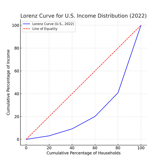
Lorenz curve and line of equality
- TFR or total fertility rate is the average number of children per woman. Higher TFR often links to lower development, less access to health care, less education for women, and greater need for child labor.
- IMR or infant mortality rate measures deaths under age 1 per 1,000 live births.
Low IMR usually suggests stronger health systems, sanitation, nutrition, and public health.
- Health care access includes distance, affordability, trained staff, medicine, and coverage.
- Literacy rate shows basic reading and writing ability and connects to schooling, job skills, and access to information.
- Energy use can show industrialization and infrastructure. Heavy fossil fuel use may rise with development but creates environmental costs. A high renewable share needs context because it could mean advanced green investment or reliance on traditional biomass.
Composite Measures and Gender Inequality
Composite measures try to show development more fully than income alone.
Human Development Index
HDI combines:
- life expectancy
- education
- GNI per capita adjusted for PPP
It ranges from 0 to 1, and higher means more developed. On a world map, very high HDI clusters in North America, Europe, Japan, South Korea, Australia, and New Zealand, while lower HDI is common in much of sub-Saharan Africa.
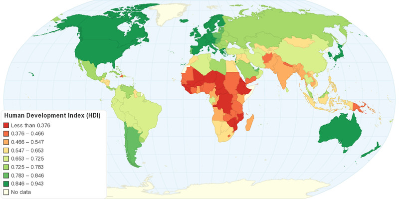
World map of Human Development Index (HDI)
Gender Inequality Index
GII measures disadvantages tied to gender through three dimensions:
- Reproductive health
maternal mortality, adolescent birth rate - Empowerment
parliamentary seats, secondary education attainment - Labor-market participation
labor-force participation rates
It also ranges from 0 to 1, but here lower is better. That contrast shows up on tests a lot. High HDI is good. High GII means more inequality.
How to Interpret Development Data on the Exam
AP questions often give you a chart, map, or table and ask what pattern it shows. The best reading uses multiple indicators together. High income often connects with low IMR or high literacy, but that is correlation, not automatic causation.
Keep these patterns in mind:
- A rich country can still have severe inequality or weak health outcomes.
- A moderate-income country can do well in education or public health.
- National averages can hide uneven development inside a country.
Key Takeaways
Development
The process through which a place changes in economic production, material living standards, health, education, and overall quality of life
Gross Domestic Product (GDP)
The monetary value of final goods and services produced within a state's borders during a specified period, regardless of ownership
Gross National Product (GNP)
The value of goods and services produced by a state's residents and firms, including their production abroad; GNP = GDP + net factor income from abroad
Gross National Income (GNI)
The total primary income received by a state's residents and businesses, including net income from abroad; GNI = GDP + net primary income from abroad
Per Capita Measure
A national total divided by the population to produce a per-person average, allowing comparisons across differently sized populations but concealing distribution
Purchasing Power Parity (PPP)
An adjustment that accounts for differences among places in the cost of a comparable set of goods and services
Sectoral Structure of an Economy
The proportions of employment or economic output in different sectors, commonly shifting from primary toward secondary and then service and knowledge activities with development
Formal Economy
Legally recognized, regulated, and recorded economic activity generally subject to taxation, labor rules, licensing, and recordkeeping
Informal Economy
Economic activity operating outside some or all government registration, taxation, and regulation and therefore often missing from official statistics
Income Distribution
The way income is divided among a population, revealing inequalities concealed by per capita averages
Lorenz Curve
A graph of cumulative population from poorest to richest against cumulative income received; greater bowing below the equality line indicates greater inequality
Gini Coefficient (Gini Index)
A measure of income inequality based on the area between the Lorenz curve and the line of perfect equality; 0 indicates perfect equality and 1, or 100, indicates maximum inequality
Total Fertility Rate (TFR)
The average number of children a woman would be expected to have during her childbearing years if current age-specific fertility rates continued
Infant Mortality Rate (IMR)
The number of deaths of children younger than one year per 1,000 live births in a given year
Access to Health Care
People's practical ability to obtain necessary medical services, determined by distance, transportation, affordability, coverage, personnel, medicine, and social barriers
Literacy Rate
The percentage of a specified population able to read and write with basic understanding, commonly measured for people age 15 and older
Energy Use as a Development Measure
Indicators such as energy use per capita, electricity access, fossil-fuel consumption, and renewable-energy share used to assess productive capacity, infrastructure, consumption, and environmental impact
Human Development Index (HDI)
A composite index combining life expectancy, schooling, and PPP-adjusted GNI per capita; values range from 0 to 1, with higher values indicating greater human development
Gender Inequality Index (GII)
A composite index of gender disadvantage in reproductive health, empowerment, and labor-market participation; values closer to 1 indicate greater inequality
Notes
Development
The process through which a place changes in economic production, material living standards, health, education, and overall quality of life
Gross Domestic Product (GDP)
The monetary value of final goods and services produced within a state's borders during a specified period, regardless of ownership
Gross National Product (GNP)
The value of goods and services produced by a state's residents and firms, including their production abroad; GNP = GDP + net factor income from abroad
Gross National Income (GNI)
The total primary income received by a state's residents and businesses, including net income from abroad; GNI = GDP + net primary income from abroad
Per Capita Measure
A national total divided by the population to produce a per-person average, allowing comparisons across differently sized populations but concealing distribution
Purchasing Power Parity (PPP)
An adjustment that accounts for differences among places in the cost of a comparable set of goods and services
Sectoral Structure of an Economy
The proportions of employment or economic output in different sectors, commonly shifting from primary toward secondary and then service and knowledge activities with development
Formal Economy
Legally recognized, regulated, and recorded economic activity generally subject to taxation, labor rules, licensing, and recordkeeping
Informal Economy
Economic activity operating outside some or all government registration, taxation, and regulation and therefore often missing from official statistics
Income Distribution
The way income is divided among a population, revealing inequalities concealed by per capita averages
Lorenz Curve
A graph of cumulative population from poorest to richest against cumulative income received; greater bowing below the equality line indicates greater inequality
Gini Coefficient (Gini Index)
A measure of income inequality based on the area between the Lorenz curve and the line of perfect equality; 0 indicates perfect equality and 1, or 100, indicates maximum inequality
Total Fertility Rate (TFR)
The average number of children a woman would be expected to have during her childbearing years if current age-specific fertility rates continued
Infant Mortality Rate (IMR)
The number of deaths of children younger than one year per 1,000 live births in a given year
Access to Health Care
People's practical ability to obtain necessary medical services, determined by distance, transportation, affordability, coverage, personnel, medicine, and social barriers
Literacy Rate
The percentage of a specified population able to read and write with basic understanding, commonly measured for people age 15 and older
Energy Use as a Development Measure
Indicators such as energy use per capita, electricity access, fossil-fuel consumption, and renewable-energy share used to assess productive capacity, infrastructure, consumption, and environmental impact
Human Development Index (HDI)
A composite index combining life expectancy, schooling, and PPP-adjusted GNI per capita; values range from 0 to 1, with higher values indicating greater human development
Gender Inequality Index (GII)
A composite index of gender disadvantage in reproductive health, empowerment, and labor-market participation; values closer to 1 indicate greater inequality
