Topic 2.3 Notes – Population Composition
What Population Composition Is
Population composition means the demographic makeup of a population. Two countries can have the same total population and still function very differently if one is full of children and the other has many elderly residents.
In this topic, AP Human Geography narrows the focus to:
- Age structure = how people are distributed across age groups
- Sex ratio = how many males there are compared with females
That matters because composition shapes demand:
- lots of children → schools, childcare, pediatric care
- lots of working-age adults → jobs, housing, transportation
- lots of elderly residents → pensions, assisted living, geriatric care
Scale matters too. A national average can hide local patterns like:
- college towns with lots of 18 to 24 year olds
- retirement communities with older residents
- military bases, mining towns, or migrant labor destinations with male-heavy working ages
A common exam move is simple. Spot the pattern first, then connect it to likely social or economic needs.
Age Structure and Sex Ratio
Age structure
Age structure shows the distribution of people across age groups.
The three broad groups are:
- Young dependents 0 to 14
- Working-age population 15 to 64
- Older dependents 65+
You’ll also see five-year cohorts like 0 to 4, 5 to 9, 10 to 14. Those are more precise and make bulges or gaps easier to see.
Typical patterns:
- Youthful structure = lots of children, often tied to high fertility; common in many sub-Saharan African countries
- Stable or slow-growth structure = age groups are more similar in size
- Aging or declining structure = smaller younger groups and larger middle or older groups; Japan is the standard example
Sex ratio
Sex ratio is the number of males per 100 females.
- Above 100 = more males
- Below 100 = more females
- At birth, the ratio is usually around 105 male births per 100 female births
The ratio usually drops with age because males have higher mortality and women tend to live longer. That’s why older cohorts often have more women.
What changes age and sex composition
These patterns come from population processes:
- Fertility shapes the base. High fertility widens younger cohorts; low fertility narrows them.
- Mortality and life expectancy shape the top. Lower mortality means more people survive to older ages.
- Migration often changes working-age groups most.
- Persian Gulf states often show male-heavy labor migration.
- Local examples include military bases, mining towns, and resource-frontier settlements.
- Social disruption like war, famine, or epidemics can leave small cohorts or sex imbalances.
- Cultural preference and policy can matter too. Son preference and sex-selective abortion contributed to male-skewed younger populations in China and India, and China’s one-child policy intensified that pattern.
Mapping Population Composition
Geographers map composition to show where these patterns cluster.
Common mapped variables include:
- percent under 15
- percent 65+
- median age
- working-age share
- total sex ratio
- sex ratio by age group
Median age is a good example because it quickly shows where populations skew older or younger across the world.
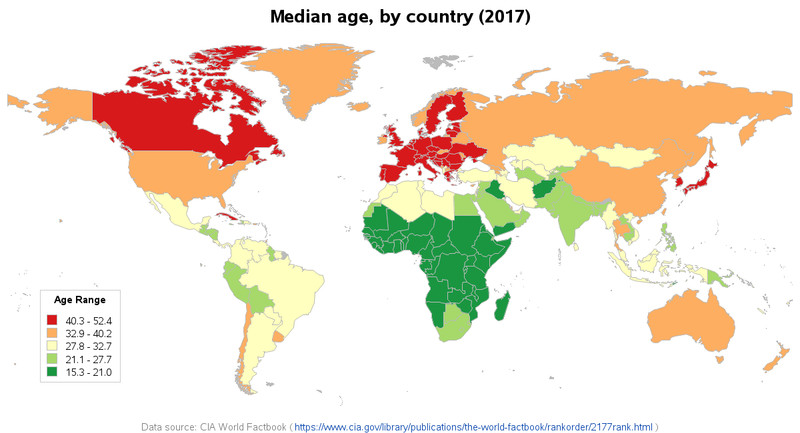
World median age by country, 2017
On a choropleth map, use percentages, rates, or ratios, not raw totals. Raw counts tell you size. Composition maps compare shares.
In this example, the main takeaway is the broad regional pattern of older populations in much of Europe and Japan and younger populations across much of sub-Saharan Africa.
Patterns to look for:
- clustering
- core-periphery
- urban-rural contrast
- isolated concentrations
A U.S. county map might show older populations in parts of Florida and Arizona, while university counties show big 18 to 24 populations. Aggregation can hide this. A country may look balanced overall but still contain male-heavy labor districts or female-heavy retirement communities.
Reading Population Pyramids
A population pyramid is a horizontal bar graph showing age and sex.
Setup:
- Age cohorts go on the vertical axis, youngest at the bottom.
- Males are usually on the left and females on the right, but always check the legend.
- The horizontal axis shows counts or percentages.
- Check the title, place, year, and units before you interpret it.
Three overall forms:
- Expansive = wide base, narrow top, rapid growth
- Stationary = more rectangular, slow or stable growth
- Constrictive = narrow base, broader middle, aging and possible decline
Features to spot:
- wide base = high recent fertility
- narrow base = low recent fertility
- broad middle = large working-age population
- broad top = many elderly, longer life expectancy
- asymmetry = male and female sides differ
- bulge = unusually large cohort
- indentation = unusually small cohort
The classic example is the U.S. baby boom from 1946 to 1964. That large cohort moves upward over time, shifting demand from schools to housing to retirement and health care. Remember, a pyramid shows a pattern, but the cause could be births, deaths, migration, or conflict.
What Population Composition Tells You
Composition helps you infer future growth and likely needs.
- Large younger cohorts suggest continued growth.
- Smaller younger cohorts than middle cohorts suggest future decline unless immigration offsets it.
You can also estimate dependency with the dependency ratio:
- youthful populations → high child dependency
- aging populations → high old-age dependency
Follow cohorts through time:
- many children → schools, childcare, pediatric care
- many young adults → universities, jobs, housing, transportation
- many elderly → pensions, geriatric care, accessible housing
Key Takeaways
Population Composition
The makeup of a population according to demographic characteristics, especially age and sex
Age Structure
The distribution of a population among age groups, reported as counts or percentages
Young Dependents
The conventional dependent-age category consisting of people ages 0–14
Working-Age Population
The conventional age category consisting of people ages 15–64
Older Dependents
The conventional dependent-age category consisting of people ages 65 and older
Cohort
A group whose members share a demographic characteristic, most commonly an age range or period of birth
Sex Ratio
The number of males per 100 females: (number of males ÷ number of females) × 100
Sex Ratio at Birth
The number of male births per 100 female births, normally about 105
Population Pyramid (Age-Sex Pyramid; Age-Sex Structure Diagram)
A paired horizontal bar graph displaying age cohorts by sex, usually with males left, females right, and youngest cohorts at the bottom
Expansive Population Pyramid
A wide-based pyramid that narrows rapidly with age, indicating a youthful population and rapid growth
Stationary or Near-Stationary Population Pyramid
A roughly rectangular pyramid with younger and middle cohorts of similar width, indicating slow or approximately stable growth
Constrictive Population Pyramid
A pyramid whose base is narrower than its middle, indicating low fertility, population aging, and possible future decline
Bulge in a Population Pyramid
A cohort substantially larger than adjacent cohorts, often caused by high births or age-selective in-migration
Indentation in a Population Pyramid
A cohort smaller than adjacent cohorts, potentially reflecting reduced births, mortality, or out-migration
Asymmetry in a Population Pyramid
A noticeable difference between corresponding male and female bars in an age cohort
Total Dependency Ratio (Dependency Ratio)
((population ages 0–14 + population ages 65 and older) ÷ population ages 15–64) × 100; people in conventional dependent-age categories per 100 people of working age
Youthful or Rapidly Growing Age Structure
An age structure with a large proportion of children and relatively few older adults, usually associated with recent high fertility
Comparatively Stable or Slowly Growing Age Structure
An age structure with cohorts of similar size through much of the population, commonly associated with low birth and death rates and slow growth
Aging or Potentially Declining Age Structure
An age structure with younger cohorts smaller than middle-aged and older cohorts, associated with sustained low fertility and long life expectancy
Notes
Population Composition
The makeup of a population according to demographic characteristics, especially age and sex
Age Structure
The distribution of a population among age groups, reported as counts or percentages
Young Dependents
The conventional dependent-age category consisting of people ages 0–14
Working-Age Population
The conventional age category consisting of people ages 15–64
Older Dependents
The conventional dependent-age category consisting of people ages 65 and older
Cohort
A group whose members share a demographic characteristic, most commonly an age range or period of birth
Sex Ratio
The number of males per 100 females: (number of males ÷ number of females) × 100
Sex Ratio at Birth
The number of male births per 100 female births, normally about 105
Population Pyramid (Age-Sex Pyramid; Age-Sex Structure Diagram)
A paired horizontal bar graph displaying age cohorts by sex, usually with males left, females right, and youngest cohorts at the bottom
Expansive Population Pyramid
A wide-based pyramid that narrows rapidly with age, indicating a youthful population and rapid growth
Stationary or Near-Stationary Population Pyramid
A roughly rectangular pyramid with younger and middle cohorts of similar width, indicating slow or approximately stable growth
Constrictive Population Pyramid
A pyramid whose base is narrower than its middle, indicating low fertility, population aging, and possible future decline
Bulge in a Population Pyramid
A cohort substantially larger than adjacent cohorts, often caused by high births or age-selective in-migration
Indentation in a Population Pyramid
A cohort smaller than adjacent cohorts, potentially reflecting reduced births, mortality, or out-migration
Asymmetry in a Population Pyramid
A noticeable difference between corresponding male and female bars in an age cohort
Total Dependency Ratio (Dependency Ratio)
((population ages 0–14 + population ages 65 and older) ÷ population ages 15–64) × 100; people in conventional dependent-age categories per 100 people of working age
Youthful or Rapidly Growing Age Structure
An age structure with a large proportion of children and relatively few older adults, usually associated with recent high fertility
Comparatively Stable or Slowly Growing Age Structure
An age structure with cohorts of similar size through much of the population, commonly associated with low birth and death rates and slow growth
Aging or Potentially Declining Age Structure
An age structure with younger cohorts smaller than middle-aged and older cohorts, associated with sustained low fertility and long life expectancy
