Topic 6.9 Notes – Urban Data
What Urban Data Show
Cities change in visible and measurable ways, but those changes also reflect power, values, and inequality in the built landscape. A neighborhood’s housing, land use, transit access, and services can all shift as different groups gain or lose influence.
Two main kinds of data help explain that:
- Quantitative data = numbers. They answer how much, where, and how fast.
- Qualitative data = words, observations, and personal accounts. They answer how change feels, what people think caused it, and what effects they notice.
The AP skill here is simple but important. Say what the source directly shows, then make a careful claim. Data can suggest causes, but they do not always prove them.
Types of Urban Data
Quantitative data
This is the numerical side of urban geography, usually from census and survey data.
Common variables include:
- Total population and density to show how many people live somewhere and how crowded it is
- Age, sex, race and ethnicity, household size, migration status to show population composition
- Education, occupation, income, poverty to show social and economic patterns
- Rent, housing value, tenure, vacancy, commuting to show housing and transportation change
These numbers help you compare places, track change over time, and map patterns within cities.
A few distinctions show up a lot on tests:
- Count vs rate/proportion
500 people in poverty is a count. 25% in poverty is a rate. Rates let you compare areas of different size. - Absolute change = new value minus old value
If population goes from 4,800 to 5,600, absolute change = 800 - Percentage change =
Same example = - Percentage points vs percent increase
Renters rising from 50% to 65% is 15 percentage points, not 15%. It is a 30% increase relative to the original 50%.
A common trap is thinking stable population means no change. A neighborhood can keep about the same total population while its income, race, age, or renter share changes a lot.
Census data
A census is a government population count. The standard example is the U.S. decennial census every 10 years.
It gives a baseline for:
- population size
- population distribution
- population composition
At the urban scale, data often use census tracts as neighborhood stand-ins. That helps analysis, but tract lines do not always match how residents define their neighborhood.
Census data are good for growth, decline, concentrations of groups, planning services, and comparing neighborhoods over time. Limits matter too:
- unhoused or mobile people may be undercounted
- categories can change
- tract boundaries can change
Survey data
A survey asks standardized questions, usually to a sample rather than everyone. The named example you should know is the American Community Survey.
- Closed-ended questions usually create quantitative data
- Open-ended questions can create qualitative data
Surveys are often more frequent and detailed than a census, but they can have sample bias, low response rates, and wording effects.
Qualitative data
Numbers show the pattern. Qualitative data show the lived experience behind it.
Field studies
Field studies use direct investigation, such as:
- observation
- interviews
- focus groups
- participant observation
- field notes
- photos
- open-ended questionnaires
They can reveal land use change, building condition, visible investment or abandonment, and community perspectives.
Narratives
Narratives include:
- oral histories
- testimony
- diaries
- extended interview responses
- personal accounts
These reveal place attachment, fear of displacement, safety concerns, and competing views of redevelopment. Their limit is representativeness. One story shows a perspective, not how common that view is citywide.
Reading Maps, Tables, and Graphs
Urban data often appear as tables, line graphs, bar graphs, population pyramids, choropleth maps, and dot-density maps.
The display does not determine the data type. A census choropleth map is still quantitative. An interview excerpt is qualitative.
A few reading rules matter a lot:
- Choropleth maps work best with rates, percentages, and densities, not raw counts
- Dot-density maps show spatial distribution and clustering
- Pattern = spatial arrangement at one time
- Trend = change over time, so you need at least two dates
- Scale matters. Tract-level data can reveal differences that citywide averages hide
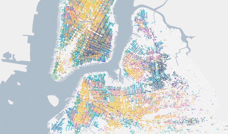
Dot-density map of neighborhood clustering in New York City
In a map like this, focus on where dots cluster and where they thin out across the city. Look for concentrations, outliers, spatial relationships, and uneven effects across neighborhoods.
Using Urban Data to Explain Causes and Effects
The strongest explanations use triangulation, which means combining quantitative and qualitative evidence.
- Quantitative data show extent, timing, and location
- Qualitative data show mechanisms and group perspectives
Causal claims get stronger when:
- the cause comes before the effect
- the pattern repeats across places or years
- comparison areas differ
- alternative explanations are considered
- field evidence shows a plausible mechanism
- multiple sources support the same conclusion
Be careful with correlation. Rising rents and rising income together show a relationship, not automatic proof of what caused what.
Effects also vary by group and scale. A project might boost city tax revenue or transit access while also increasing displacement pressure nearby. A strong AP answer states what the source shows, connects it to an urban process, and stops where the evidence stops.
Key Takeaways
Quantitative Data
Numerical measurements or counts used to show the amount, distribution, and rate of urban change
Qualitative Data
Descriptions, observations, meanings, and accounts used to show experiences and attitudes toward urban change
Census Data
Population and housing information from a government effort intended to count an entire population at regular intervals
Survey Data
Information collected by asking standardized questions, usually from a sample used to estimate characteristics of a larger population
Choropleth Map
A map that shades geographic units according to a variable’s value, usually a rate, percentage, or density
Dot-Density Map
A map that places dots within areas, with each dot representing a specified number of people or events
Population Size
The number of people living in an urban area or one of its subdivisions
Population Composition
The characteristics of a population, such as age, sex, race, ethnicity, income, education, household type, or migration status
Field Study
Systematic direct investigation of a place or community through methods such as observation, interviews, or field documentation
Direct Observation
Firsthand, systematic recording of visible land use, building conditions, activity, and uses of urban space
Semistructured Interview
An interview using common prepared questions while allowing follow-up questions and detailed responses
Focus Group
A guided discussion among several participants used to reveal areas of agreement and disagreement
Participant Observation
Qualitative research based on sustained involvement in the activities of the community being studied
Narrative
An individual account of places, events, or change over time, such as an oral history, testimony, diary, or personal account
Triangulation
Using multiple data sources or methods to investigate the same process and strengthen an explanation
Count
The number of people or observations in a category
Proportion
A category’s share of the total population or set of observations
Absolute Change
The numerical difference between a new value and the original value: new value − original value
Percentage Change
Change relative to the original value: (new value − original value) ÷ original value × 100
Percentage-Point Change
The difference obtained by subtracting an original percentage from a new percentage
Relative Percentage Change
The difference between two percentages divided by the original percentage, multiplied by 100
Closed-Ended Question
A question with predetermined response options that generally produces quantitative data
Open-Ended Question
A question that permits respondents to answer in their own words and can produce qualitative data
Pattern
A spatial arrangement visible at a particular time
Trend
Directional change identified through comparable data from multiple times
Notes
Quantitative Data
Numerical measurements or counts used to show the amount, distribution, and rate of urban change
Qualitative Data
Descriptions, observations, meanings, and accounts used to show experiences and attitudes toward urban change
Census Data
Population and housing information from a government effort intended to count an entire population at regular intervals
Survey Data
Information collected by asking standardized questions, usually from a sample used to estimate characteristics of a larger population
Choropleth Map
A map that shades geographic units according to a variable’s value, usually a rate, percentage, or density
Dot-Density Map
A map that places dots within areas, with each dot representing a specified number of people or events
Population Size
The number of people living in an urban area or one of its subdivisions
Population Composition
The characteristics of a population, such as age, sex, race, ethnicity, income, education, household type, or migration status
Field Study
Systematic direct investigation of a place or community through methods such as observation, interviews, or field documentation
Direct Observation
Firsthand, systematic recording of visible land use, building conditions, activity, and uses of urban space
Semistructured Interview
An interview using common prepared questions while allowing follow-up questions and detailed responses
Focus Group
A guided discussion among several participants used to reveal areas of agreement and disagreement
Participant Observation
Qualitative research based on sustained involvement in the activities of the community being studied
Narrative
An individual account of places, events, or change over time, such as an oral history, testimony, diary, or personal account
Triangulation
Using multiple data sources or methods to investigate the same process and strengthen an explanation
Count
The number of people or observations in a category
Proportion
A category’s share of the total population or set of observations
Absolute Change
The numerical difference between a new value and the original value: new value − original value
Percentage Change
Change relative to the original value: (new value − original value) ÷ original value × 100
Percentage-Point Change
The difference obtained by subtracting an original percentage from a new percentage
Relative Percentage Change
The difference between two percentages divided by the original percentage, multiplied by 100
Closed-Ended Question
A question with predetermined response options that generally produces quantitative data
Open-Ended Question
A question that permits respondents to answer in their own words and can produce qualitative data
Pattern
A spatial arrangement visible at a particular time
Trend
Directional change identified through comparable data from multiple times
