Topic 3.3 Notes – Survivorship Curves
What Survivorship Curves Show
A survivorship curve is a graph of the relative survival of a cohort over its life span. A cohort is a group of individuals the same age, usually born or hatched around the same time. The curve follows that one group from birth to the maximum age reached by any member.
This matters because the graph is tracking survival through age, not total population size.
- It is not a population growth graph. Population growth graphs show total population size over time.
- It is not an age structure diagram. Age structure diagrams show how many individuals are in each age group at one moment.
The axes tell you what the graph means:
- x-axis = age, life stage, or percent of maximum life span
- y-axis = survivorship, shown as number, proportion, or percent of the original cohort still alive
Often the y-axis is logarithmic, which helps compare very large drops in survivor number.
Relative survivorship can be written as
where is the original cohort size and is the number still alive at age .
Because each curve starts at or near 100% of the original cohort, you can compare species even if one starts with 10 offspring and another starts with 10,000. The example below shows the three classic curve shapes you will use throughout this topic.
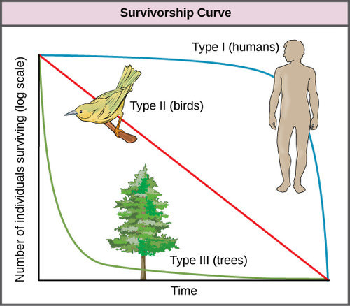
Survivorship curves
The Three Types of Survivorship Curves
These are idealized models. Real species can fall between them or shift under different conditions.
Type I
A Type I curve stays high for most of life, then drops steeply in old age.
- Mortality is concentrated in older age classes
- Often linked to senescence, which is aging-related decline
- Common traits:
- few offspring
- high parental care
- high investment per offspring
- Usually associated with K-selected species
Examples: humans, elephants, many large mammals
Type II
A Type II curve declines at a fairly steady rate across the life span.
- Mortality risk is roughly constant across ages
- This means a similar probability of dying in each age interval
- It does not mean the same number die each interval
- On a log-scaled y-axis, it often looks like a straight diagonal line
This pattern can happen when predation, disease, or environmental risk affects individuals fairly evenly across ages.
Examples: many birds, some rodents, some reptiles
Type III
A Type III curve drops sharply early, then levels off.
- Mortality is concentrated in early life
- Common vulnerable stages include eggs, larvae, seeds, and juveniles
- Common traits:
- many offspring
- little or no parental care
- low investment per offspring
- Usually associated with r-selected species
Examples: oysters, many fish, amphibians, insects, plants producing many seeds
How to Read the Pattern on a Curve
The shape tells you when mortality happens.
- A flat segment means low mortality during that age range.
- A steep segment means high mortality during that age range.
- A higher position at a given age means a larger fraction of the original cohort is still alive.
- A Type I pattern means most mortality happens late.
- A Type II pattern means mortality is spread fairly evenly.
- A Type III pattern means most mortality happens early.
One common AP trap is the Type II line. On a log y-axis, a straight line means constant proportional mortality, not the same number dying each time.
Also, every survivorship curve declines. Dead individuals do not reenter the cohort.
Survivorship Curves and Reproductive Strategy
This is where life-history strategy connects to curve shape.
- K-selected species usually have fewer offspring, more parental investment, and higher juvenile survival. They usually show Type I, sometimes Type II.
- r-selected species usually have many offspring, little parental investment, and high juvenile mortality. They usually show Type III.
This relationship is general, not absolute. A species can show an intermediate pattern, and different populations of the same species can differ.
What Survivorship Curves Can and Cannot Tell You
A survivorship curve tells you when mortality happens. It does not automatically tell you why.
To explain the pattern, connect it to things like:
- parental care
- offspring number
- predation
- disease
- resources
- environmental stress
Examples the course likes:
- Humans with better sanitation, healthcare, and nutrition show a stronger Type I pattern.
- Wildlife under harsh breeding seasons or heavy predation may show more early mortality.
For data questions, identify the curve type, describe the mortality pattern, then link it to life-history strategy.
Key Takeaways
Survivorship Curve
A graph showing the proportion of an original same-age cohort still alive at each age, from birth to the maximum age reached
Cohort
A group of individuals of the same age, usually born or hatched during the same period, that is followed through its life span
Relative Survivorship (l_x)
The fraction of the original cohort alive at age x: l_x = n_x/n_0; multiply by 100 to express it as a percentage
Type I Survivorship Curve
High survival through early and middle life followed by steep late-life mortality; typical of K-selected species with few offspring and high parental investment
Type II Survivorship Curve
A roughly age-independent risk of death, shown as an approximately straight decline on a logarithmic survivorship axis; it can occur in K-selected species
Type III Survivorship Curve
Very high early-life mortality followed by greater survival among the few remaining individuals; typical of r-selected species with many offspring and little parental care
Notes
Survivorship Curve
A graph showing the proportion of an original same-age cohort still alive at each age, from birth to the maximum age reached
Cohort
A group of individuals of the same age, usually born or hatched during the same period, that is followed through its life span
Relative Survivorship (l_x)
The fraction of the original cohort alive at age x: l_x = n_x/n_0; multiply by 100 to express it as a percentage
Type I Survivorship Curve
High survival through early and middle life followed by steep late-life mortality; typical of K-selected species with few offspring and high parental investment
Type II Survivorship Curve
A roughly age-independent risk of death, shown as an approximately straight decline on a logarithmic survivorship axis; it can occur in K-selected species
Type III Survivorship Curve
Very high early-life mortality followed by greater survival among the few remaining individuals; typical of r-selected species with many offspring and little parental care
