Topic 3.6 Notes – Age Structure Diagrams
What Age Structure Diagrams Show
An age structure diagram is a graph of a population split by age and sex. You’ll also hear population pyramid, even though many of these graphs are not shaped like pyramids.
Each horizontal bar is an age cohort, usually a 5-year group like 0-4, 5-9, or 10-14.
Standard layout
- Vertical axis shows age
- youngest at the bottom
- oldest at the top
- Horizontal axis shows either population count or percentage
- Males are usually on the left and females on the right
- but always check labels because graphs can switch this
This example uses percentages and follows the usual layout with males on the left and females on the right.
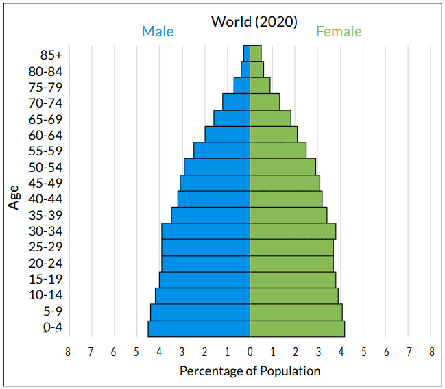
Age structure diagram for the world in 2020
Counts vs percentages
This is a common test trap.
- Count-based diagrams show actual population size if you know the scale.
- Percentage-based diagrams show the share of the population in each age group, which makes country-to-country comparison easier.
- A wide bar on a percentage graph means that age group is a large portion of the population. It does not mean the country has a huge total population.
Broad age groups
These age groups help you interpret future change:
- Pre-reproductive about ages 0-14
- Reproductive about ages 15-44
- Post-reproductive about ages 45+
What matters most is the size of the pre-reproductive group compared with the reproductive group. That tells you how many people are likely to enter childbearing years soon.
The Main Diagram Shapes and What They Mean
You usually read these graphs by the overall shape, especially the base compared with the middle. A quick way to remember the three patterns is to compare a broad-based pyramid, a more column-like shape, and a narrower-base, top-heavy shape like the examples below.
Rapidly growing population
- Broad base, narrower bars higher up
- Often looks like a triangle or classic pyramid
- Shows a high proportion of young people
- Suggests many people will soon enter reproductive age
- If current patterns continue, births will likely exceed deaths
Stable or slowly growing population
- Younger and middle-age bars are more similar in width
- Often looks column-shaped, bell-shaped, or nearly rectangular
- Generations are roughly replacing each other
- Births and deaths are more balanced
- A slightly wider base can mean slow growth, not perfect stability
Declining population
- Base is narrower than the middle
- Can look urn-shaped, constricted, or top-heavy
- Young cohorts are smaller than reproductive-age cohorts
- Fewer young people are available to replace older generations
- This suggests long-term decline if current patterns continue
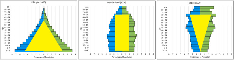
Population pyramid shape patterns
How to Interpret a Diagram
When you explain one, move from the graph to the population trend.
- Identify the place, year, axes, units, age intervals, and which side is male or female.
- Check whether the horizontal axis shows numbers or percentages.
- Compare the youngest cohorts to the reproductive-age cohorts.
- Read the overall shape, not one weird bar.
- Classify it as rapid growth, relative stability, or decline.
- Explain it with cohort replacement
- larger young cohorts = more future parents
- smaller young cohorts = fewer future parents
- Use cautious AP-style wording
- “likely to grow”
- “indicates a declining trend if current patterns continue”
Population Momentum and Irregular Shapes
Population momentum means a population can keep changing because of its existing age structure, even after fertility changes.
- A country with a broad base may keep growing even if family size drops, because so many young people will soon become parents.
- An aging population may keep shrinking even if fertility rises, because there are relatively few potential parents.
You may also see irregular bars:
- Bulge = unusually large cohort
- Notch = unusually small cohort
Possible causes include:
- baby booms
- war
- famine
- epidemics
- migration
Male-female differences can reflect sex ratio at birth, war deaths, different death rates, or migration. Future births are tied especially to the number of females entering reproductive ages.
Why Age Structure Matters
These diagrams show demographic potential, not guaranteed outcomes. Real population change can still be altered by fertility, mortality, immigration, and emigration.
Common mistakes:
- A broad base does not mean the largest total population
- A narrow top alone does not prove rapid growth
- A stable population is not a perfect rectangle
- One unusual cohort should not outweigh the overall shape
Environmental significance shows up fast:
- Broad-based populations often mean rising demand for food, freshwater, housing, energy, sanitation, transportation, schools, and jobs
- Aging populations often need more healthcare and elder services
Key Takeaways
Age Structure Diagram (Population Pyramid)
Graph showing a population’s distribution by age and sex at a particular time, with age on the vertical axis and population number or percentage on the horizontal axis
Age Cohort
People within a specified age interval, commonly a five-year range represented by one horizontal bar on an age structure diagram
Pre-Reproductive Population
The approximate 0–14 age group whose size indicates how many people will soon enter reproductive ages
Reproductive Population
The approximate 15–44 age group representing people currently of reproductive age
Post-Reproductive Population
The approximate age-45-and-older group representing people beyond the course’s demographic reproductive-age category
Rapidly Growing Population Age Structure
Broad-based, pyramid-like shape with younger cohorts larger than older cohorts, indicating likely rapid growth as many young people enter reproductive age
Stable or Slowly Growing Population Age Structure
Column-like, bell-shaped, or nearly rectangular structure; similar-width younger and middle cohorts indicate relative stability, while a slightly wider base indicates slow growth
Declining Population Age Structure
Narrow-based, urn-shaped, or top-heavy structure with younger cohorts smaller than middle cohorts, indicating likely long-term decline
Population Momentum
The tendency of a population to keep growing or declining because of its existing age distribution even after fertility changes
Bulge
An age cohort unusually large relative to neighboring cohorts, often reflecting past fertility, mortality, or migration changes
Notch
An age cohort unusually small relative to neighboring cohorts, often reflecting past fertility, mortality, or migration changes
Notes
Age Structure Diagram (Population Pyramid)
Graph showing a population’s distribution by age and sex at a particular time, with age on the vertical axis and population number or percentage on the horizontal axis
Age Cohort
People within a specified age interval, commonly a five-year range represented by one horizontal bar on an age structure diagram
Pre-Reproductive Population
The approximate 0–14 age group whose size indicates how many people will soon enter reproductive ages
Reproductive Population
The approximate 15–44 age group representing people currently of reproductive age
Post-Reproductive Population
The approximate age-45-and-older group representing people beyond the course’s demographic reproductive-age category
Rapidly Growing Population Age Structure
Broad-based, pyramid-like shape with younger cohorts larger than older cohorts, indicating likely rapid growth as many young people enter reproductive age
Stable or Slowly Growing Population Age Structure
Column-like, bell-shaped, or nearly rectangular structure; similar-width younger and middle cohorts indicate relative stability, while a slightly wider base indicates slow growth
Declining Population Age Structure
Narrow-based, urn-shaped, or top-heavy structure with younger cohorts smaller than middle cohorts, indicating likely long-term decline
Population Momentum
The tendency of a population to keep growing or declining because of its existing age distribution even after fertility changes
Bulge
An age cohort unusually large relative to neighboring cohorts, often reflecting past fertility, mortality, or migration changes
Notch
An age cohort unusually small relative to neighboring cohorts, often reflecting past fertility, mortality, or migration changes
